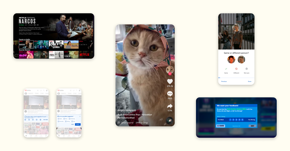
Software ate the world, and now machine learning is eating software. More and more products are using ML to provide suggestions, rank content, or filter junk, thus making ML increasingly central to the user experience. When ML is good, it can create a delightful and frictionless user experience, like on TikTok. But making that happen requires ML and product design to work together – ML isn’t a magic black box that produces great experiences on its own. Under the hood, ML systems are just making predictions off of past data, and design decisions have a massive impact on the quantity and quality of that data (commonly referred to as signal). Thus, designers can have a massive impact on ML systems through their decisions. To unpack this, let’s look at some design patterns found in popular products and see how those patterns impact the ML in those products.
Turn user satisfaction into clear signal
Nearly all social/UGC products use ML to rank a feed of content that is most likely to engage a user. The most important signals are often related to a user’s explicit behavior – who they’ve followed, what they’ve liked or commented on, etc. If you use social products as much I do, the ML has a lot of signal to use; however, that case is not representative: many users rarely take explicit actions like following or liking, and a surprisingly large amount won’t follow users or like any content, ever. It is very hard to effectively rank a feed for a user when they haven’t provided any explicit signal, and those users are often the least engaged and thus provide the biggest opportunity for increasing engagement.
A common solution to this problem is to turn to less explicit subtle signals: what users have clicked on, read, or watched. Those subtle signals may be more frequently present, but they tend to be noisier: did they really read that story, or just scroll past it? Was that video actually watched, or was it mis-clicked and playing in the background?
Consider Twitter, where the feed usually has 2-5 tweets visible in the viewport. If a user came to Twitter, scrolled the timeline, and saw a dozen tweets but didn’t interact with any of them, were those good tweets to show that user? Maybe some were good and others weren’t but Twitter doesn’t get any signal about it – they just know that tweet showed up in the viewport. If a user laughed at it, showed it to someone nearby, etc. that is indistinguishable from the tweet right below it that they hated – or didn’t read altogether:
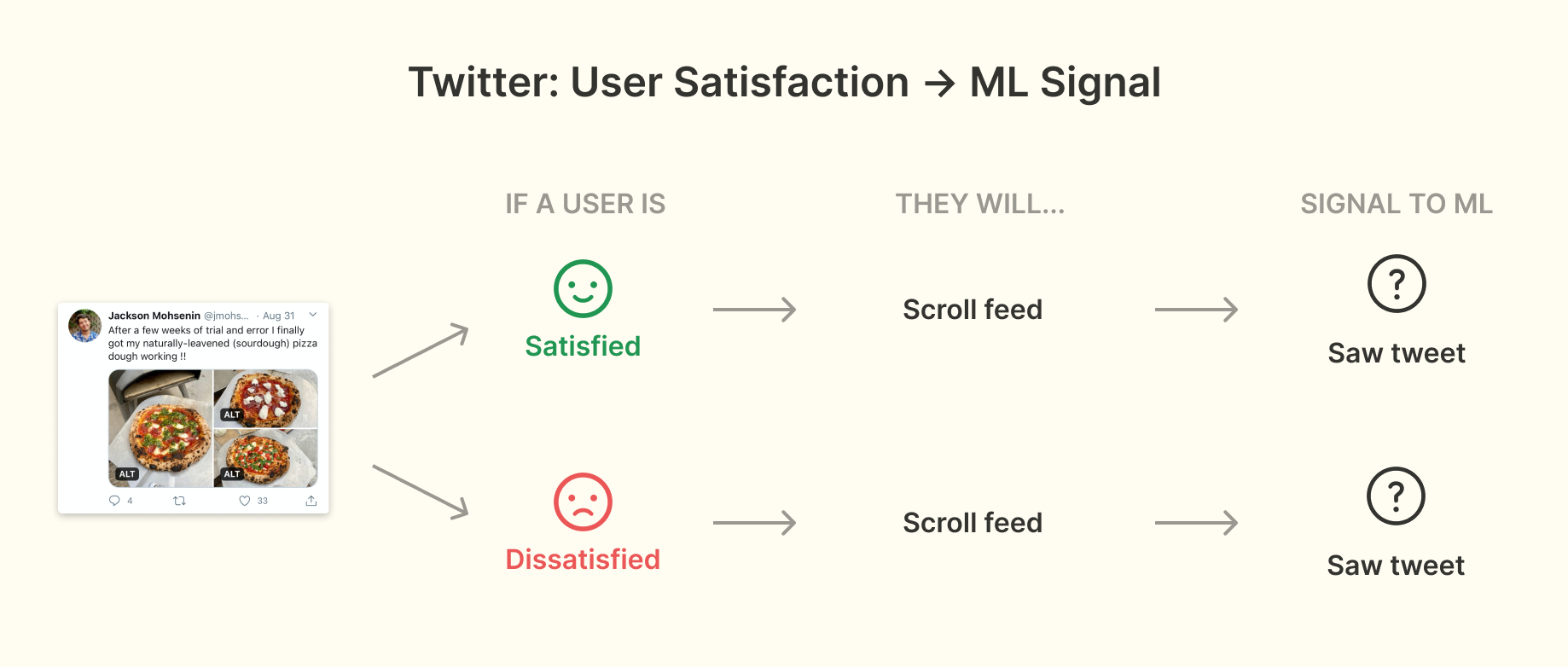
If you imagine that a huge percentage of users fall into this pattern of behavior you can see why this signal loss is such a problem. What can you do about it? TikTok has an answer.
TikTok videos take up the entire screen and play automatically, so a user can only be watching one video at a time. Users also have to explicitly advance to the next video – there is no auto-advance. This turns a subtle signal into an explicit one: every video gets a clear watch time:
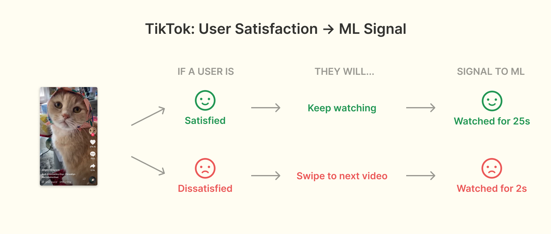
If a user really loved a video, there is a good chance they watched it more than once, and if a video was quickly skipped, there is a high chance they didn’t want to watch it. Crucially, regardless of whether or not you’re someone who takes explicit actions, TikTok gets clear signal about which videos you watch. Combined with other ML techniques like clustering, this signal is strong enough that TikTok can provide a good experience after only showing a new user 8 videos.
TikTok’s decision to not auto-advance videos after they are watched (and to not even provide a setting for it) invites a deeper question around what makes for the best user experience when ML is a core part of the product. Many users would prefer to have the option to auto-scroll (there is even a Change.org petition about it), but doing so would mean a big loss of signal – TikTok wouldn’t get signal on whether I actually watched a video or if I was just waiting for the next one. That clear watch time signal would become subtle. That subtle signal would be harder for the ML to work with, leading to a worse feed and then worse user experience over time. Thus the decision to not allow for auto-advance can be viewed as a user experience hit in the short-term for a user experience gain in the long-term. These types of tradeoffs exist in almost every ML-powered product but are very under-discussed publicly, something that I think needs to change if we’re to make good user experience decisions for ML-powered products.
Make UI denser to give ML a break
ML is frequently used to help users make choices, e.g. which product to buy product or movie to watch. Deciding which choices to show to the user is a key challenge, especially when the product has limited signal about a user’s preferences. In these cases, a successful strategy is often to make interfaces denser to show more options on a single screen. Doing so helps ‘take pressure’ off of the ranking. Netflix is a perfect example of this:
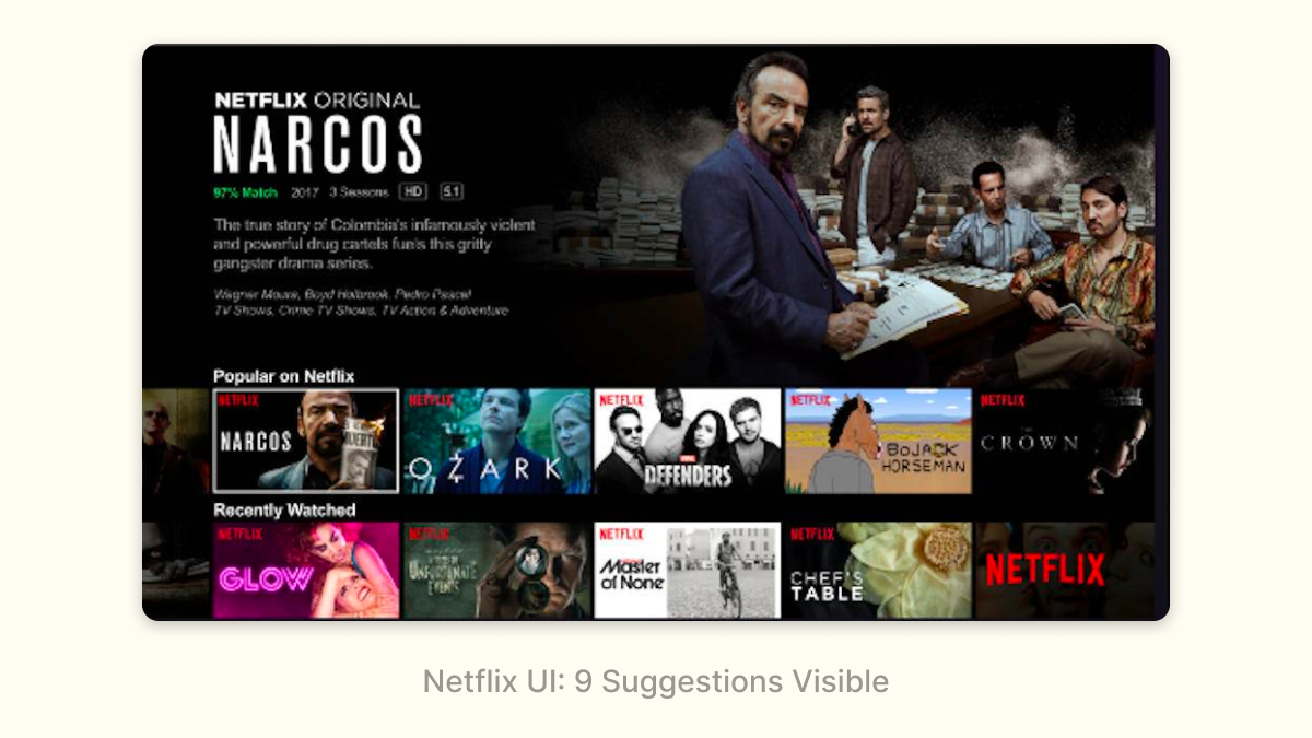
Netflix recommendations are split up into categorized rows, thus allowing users to navigate horizontally and vertically. This benefits both the user experience and the ML:
- Users can see around 9 recommendations on the initial screen, and each vertical navigation click/tap gives ~5 new recommendations (one row). This is pretty efficient for the user – with only a few clicks/taps they can see a couple dozen recommendations. The more recommendations that get shown, the less pressure there is for the ML to get any single recommendation right. Imagine you’re trying to recommend a movie to a friend – you’d do a much better job if you could give them five choices than if you could only give them one.
- The categorized rows represent genres or moods, allowing users to navigate at a higher level of fidelity than individual movies. This is a good user experience – sometimes you just know you’re in the mood for an Emotional Fight-The-System-Documentary – and it also makes the ML problem easier by splitting a single complex problem (“what does this user want to watch?”) into two simpler ones (“what categories does this user like?” and “what movies in this category would a user want to watch?”)
- Users have the chance to get a great out-of-left-field recommendation: the density of the UI decreases the cost of a bad recommendation, so the ML can take a risk every once in a while.
The benefits of this become very obvious if you ever used Hulu’s old interface:
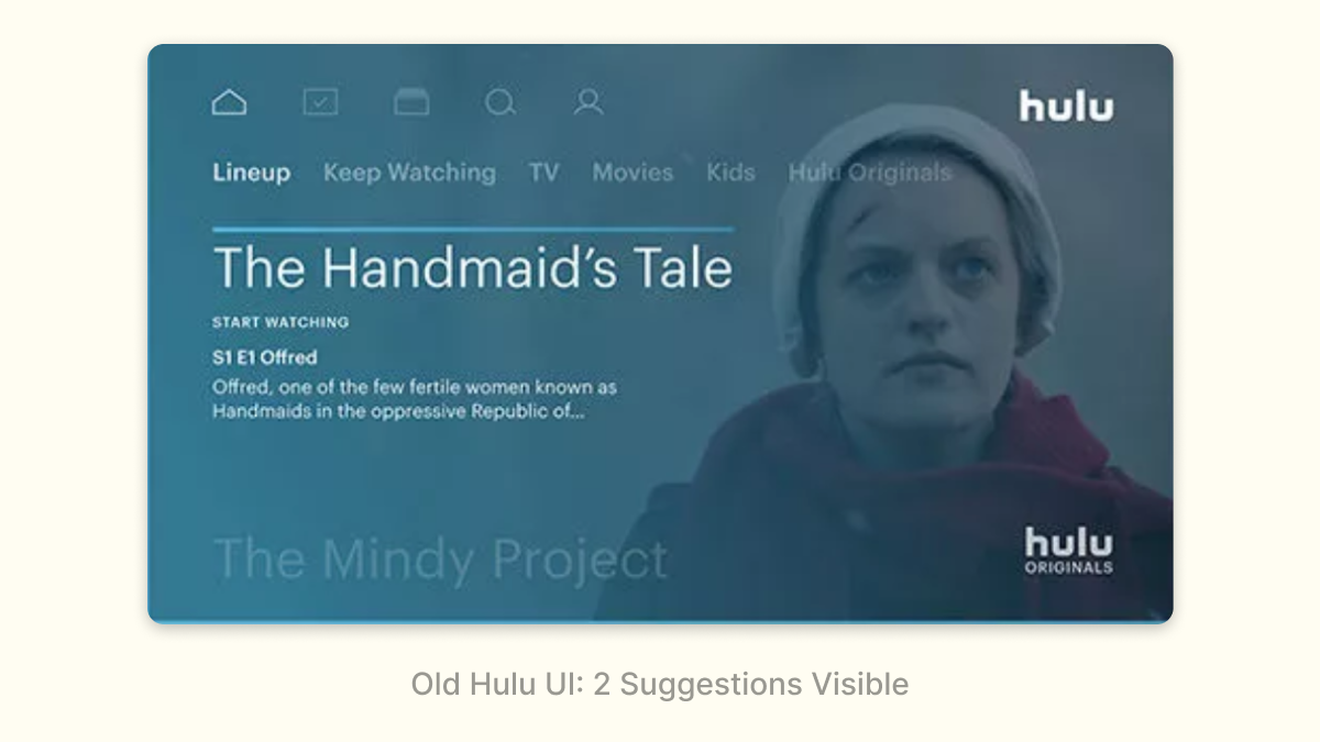
Hulu used to only show 2 (!) shows on the initial screen, and each vertical navigation click/tap only revealed one additional recommendation. This interface puts a lot of pressure on the ML: if those two initial recommendations aren’t good, users aren’t going to expect the additional recommendations to be good either. Navigating those recommendations are a pain: I have to do it one at a time versus getting an entirely new row on Netflix.
It’s not a surprise that Hulu recently adopted a new interface that is much more similar to Netflix:
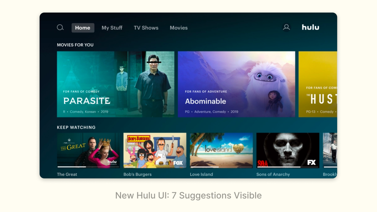
Density isn’t always better: at some point, too many choices can overwhelm users, and if there isn’t enough information shown on each recommendation for a user to even discern what the recommendation is, the density is hurting. But in general, density can be an effective pattern, especially in cases where the ML has low-confidence in any individual recommendation.
Turn a chore into a game
Sometimes, the signal that the ML needs isn’t interesting for a user to provide. A great approach in situations like this is to turn what would otherwise be a chore into a game that makes signal collection breezy and fun. Google Photos does this really effectively with face detection: asking “same or different person/” in a fun game-like interface:
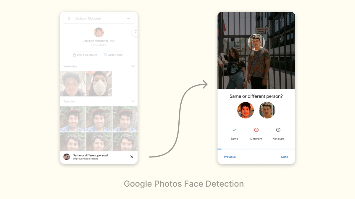
Gamification isn’t a panacea; don’t expect the amount of signal collected to increase by orders of magnitude. But it can be a useful optimization strategy, and get you over barriers where the ML might otherwise be useless.
Survey at the right time
Finally, a dry but effective pattern is to just survey users. However, prompting a survey at the right time and in the right context is essential, otherwise, your product can feel like one of those awful ecommerce websites that prompt you on the first page.
Youtube occasionally surveys users to rate videos in their feed, with a follow-on question to explain why they gave that rating:
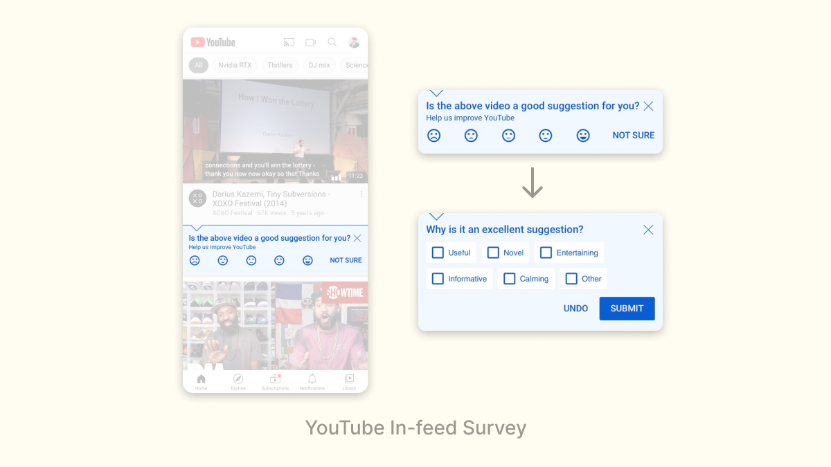
This is a great survey because of how unobtrusive it is: a user can simply ignore it if they aren’t in the mood to give feedback, but if you are, they layer on the questions to generate additional signal.
Similarly, Fortnite surveys players after a match to see what they think of recent changes to the game:
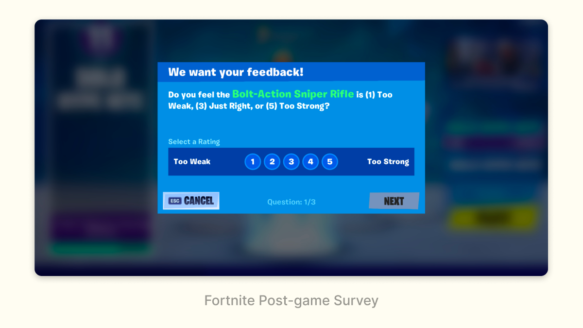
This is a great context to ask players about changes: right after they’ve experienced them.
These sorts of surveys have a very low conversion rate (<1% of users would respond) but it can still be useful as a high-level signal or pulse check.
What Comes Next?
These are a few of the most effective interfaces for helping ML today, but they are by no means the ceiling: much better interfaces will be designed. However, I don’t think we’ll stumble on them; navigating the interplay between design and ML will require the development of what is today a gray zone. Public discourse among practitioners about these topics is limited and most organizations don’t set up design and ML to succeed together. Both of these things must change if we’re to create much better user experiences in the future. My hope is that by explaining some basics with this post (and more in the future) we can start creating the common knowledge necessary to turn this gray zone into a full-fledged field.
