This week, an idea that’s circulated in the design community for the last couple of years has come back into play: that non-intuitive, primarily gesture-based interfaces have been key to Snapchat’s success and moreover constitute good design. From Intuitive Design vs Shareable Design by Josh Elman:
I’m here to tell you that the obscurity of Snapchat’s design is not a bug, it’s a feature. Just like Tinder, it’s a design that’s made to engage people and encourage them to share their experiences with others. In fact, it is a key part of what has made Snapchat so successful. Snapchat is one of the greatest examples of what I call “shareable design.”
Snapchat is no doubt successful, but I’m skeptical that their gesture-based “shareable” interface is the reason behind that success – if anything, I bet it’s hindered them.
Success has many mothers and Snapchat is no exception: their opaque interface, the early adoption by ‘cool’ LA teens, and the content rules that enabled anxiety-free sharing have all been touted as central to their success. But we should be skeptical of the claim that their unintuitive interface was in fact beneficial – few products succeed because of their interface alone, as opposed to the utility they provide (which their interface may be a part of unlocking).
Snapchat themselves seem to be moving away from their own interface, adding additional affordances for many actions:
 Snapchat used to have no add to story link in the stories screen (left). They’ve since added a link to post to your story in that screen (right)
 Snapchat used to have no affordance of how to reply to snaps (left). They’ve since added a reply affordance (right)
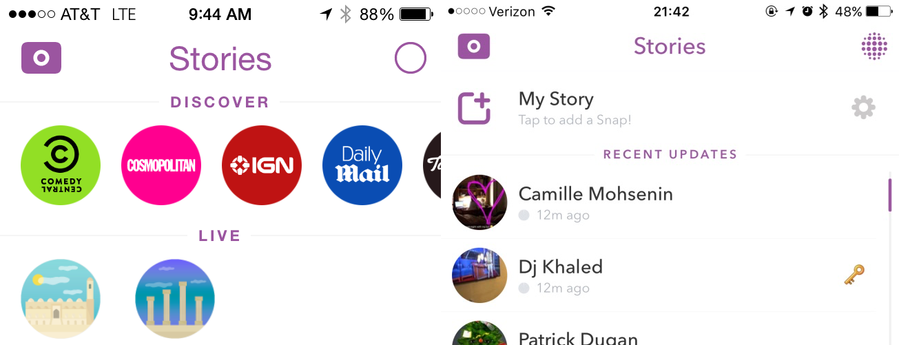
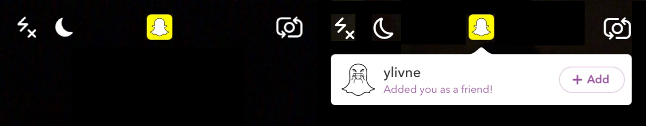 Snapchat used to just show a yellow ghost when someone added you (left). They’ve since added a call-to-action with an inline accept link (right)
Returning to the content rules, the fact that photos and videos shared on Snapchat disappear within a set time window was a key driver for their success. This was the core utility the product provided – early cool users or playful brand may have added leverage, but the ephemeral nature of the network eliminated the posting anxiety that existed on other networks. The anxiety created on other networks was the opening Snapchat was able to exploit.
There’s another claim that because mobile devices are always with us, we learn their interfaces by watching other people use them:
The second shift, and this is what many interface designers don’t yet understand, is that people learn how to do things in the real world by watching others. The way most 18 year olds learn how to use a new app is by watching their friends. It’s right there, on their friend’s phone, so they just pull the phone out and show them something.
This may be true, but I don’t think it represents a shift – this is always how we’ve learned. We learn to throw a ball or pick up a cup from others, but critically, these objects are still as intuitive as possible. Learning always has costs, even if we’re learning from others. I struggle to think of a single example of a real-world tool, socially-learned or not, that is deliberately unintuitive that people enjoy using. I bet this is doubly true in software, where even the most realistic gesture-based software is still metaphorical or representative. When 14% of users can barely figure out how to delete an email and 26% of users can’t use computers at all, what do we expect most users to be able to accomplish with a gesture-based app, even when they learn from others? An important question becomes: could Snapchat have been more successful if their interface was more intuitive? Their main competitor, Instagram, with an intuitive interface that largely adheres to general app conventions, boasts 300 million daily active users compared to Snapchat’s 100 million.
I think the path forward is more research into understanding how users – and just not 18-year-old ones – understand non-intuitive gesture-based interfaces. I worry that a successful company has us confusing correlation and causation, as often happens in design, and the result will be a slew of apps that don’t actually serve end user needs. For every Snapchat, there are dozens of interfaces like 3D Touch, which few use and fewer understand. Trends aside, intuitiveness and usability remain critical to software adoption and use. Last, there is no tension between intuitiveness and share-ability. The fact that more learn how to use software from others today doesn’t mean software can’t be easy to use.
References
- Intuitive Design vs. Shareable Design
- The Distribution of Users’ Computer Skills: Worse Than You Think
- Instagram Today: 500 Million Windows to the World
- Snapchat’s Spiegel to Investors: We Have 8 Billion Video Views a Day
This post was originally published to the Quora Design Blog.