<?xml version="1.0" encoding="utf-8"?><feed xmlns="http://www.w3.org/2005/Atom" ><generator uri="https://jekyllrb.com/" version="3.10.0">Jekyll</generator><link href="https://jmohsenin.com/feed.xml" rel="self" type="application/atom+xml" /><link href="https://jmohsenin.com/" rel="alternate" type="text/html" /><updated>2026-10-06T03:59:33+00:00</updated><id>https://jmohsenin.com/feed.xml</id><title type="html">Jackson Mohsenin</title><author><name>{&quot;twitter&quot;=&gt;&quot;jmohsenin&quot;}</name></author><entry><title type="html">How I use Roam Research</title><link href="https://jmohsenin.com/roam-research" rel="alternate" type="text/html" title="How I use Roam Research" /><published>2020-12-31T00:00:00+00:00</published><updated>2020-12-31T00:00:00+00:00</updated><id>https://jmohsenin.com/roam-research</id><content type="html" xml:base="https://jmohsenin.com/roam-research"><![CDATA[<p>I stared at screens a lot this year. Roam Research made that time mostly worth it.</p>

<p>Roam is what you make of it. It’s ostensibly a note-taking app with an obtuse UI, but its product mechanics – bi-directional linking, easy page creation, embedding – allow for “networked thought” in a way that isn’t easy in other apps. Folks who use it religiously often describe it as a ‘second brain’. It’s extremely flexible: almost any writing process is possible in Roam, and increasingly Roam itself can be modified (e.g. support for custom CSS and JS).</p>

<p>Before using Roam I used note-taking apps sparingly and didn’t do any long-form writing or reflection outside of work. I journaled on and off but never developed a habit; I generally didn’t think of writing as a tool in my tool belt. Roam changed that. I started using it for journaling, but the use cases grew and grew, and eventually encompassed almost everything I type, save for messaging. Blog posts, grocery lists, recipe notes, book quotes, and more are all in Roam.</p>

<!--break-->
<p>This happened because the product encourages you to write first and organize later. Writing in it versus Notion/Quip/G Docs is akin to the difference between sharing an Instagram story vs a post: the reduced friction means you create so much more. It’s helped me work through messy interpersonal issues, connect ideas between different books/movies/games, and improve my pizza game. No other piece of software has changed my thinking habits as much since the iPhone. I’m better off because of the habits Roam helped me create, and I think those will stick regardless of whether Roam the company sticks around.</p>

<p>It also got a ridiculously steep learning curve. I’ve raved to a lot of friends about it, but they’ve struggled to get into it given how flexible and unguided it is. Roam didn’t click for me until I took a <a href="https://www.effortlessoutput.com/">paid course on it</a>, not something a sane person should do for note-taking software. How you use Roam is downstream of your goals, which are probably different than mine. Roam’s flexibility means that even if we have similar goals we could achieve them in wildly different ways. What I wish I had when I was starting out with Roam was a bunch of examples of how other people used it, in grisly detail. So here’s how I use Roam.</p>

<p><em>I’m assuming you’re familiar with the basics; if you’re not, <a href="https://nesslabs.com/roam-research">this guide is a great place to start</a>.</em></p>

<h3 id="journaling">Journaling</h3>

<p>Roam creates a page for every day called the Daily Note, it’s also the logged-in homepage. It’s the only part of Roam that is opinionated: even if you leave it blank, Roam will still create a daily note every day. I use it as a log of what I did that day, but keep most long-form writing out of daily notes. I experimented with writing exclusively in Daily Notes, but I found that discouraged me from refactoring older writing as I acquired new info.</p>

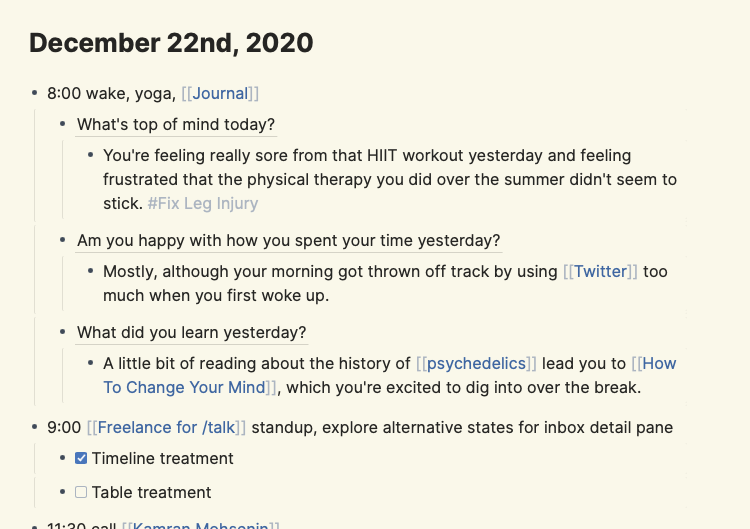
<p>I like keeping track of where my time goes, so I structure my daily note as blocks of time:</p>

<p><img src="/assets/images/roam-research--1.png" alt="My Daily Journaling in Roam" /></p>

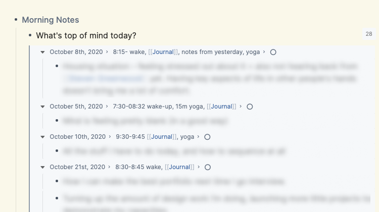
<p>The only writing I keep in the daily note is journaling. My current method is a morning reflection with three prompt questions:</p>

<ul>
  <li>What’s top of mind?</li>
  <li>Are you happy with how you spent your time yesterday?</li>
  <li>What did you learn yesterday?</li>
</ul>

<p>I started journaling in second-person perspective after seeing <a href="https://twitter.com/nickcammarata/status/1316431198407651328">how Nick Cammarata uses Roam</a>, and have been surprised how much easier it is for me to be tender than when I write in first-person. These questions are references to blocks in the [[Journal]] page. By doing this, I can read all the entries about that specific question:</p>

<p><img src="/assets/images/roam-research--2.png" alt="Aggregated Journal Entries" /></p>

<h3 id="taking-notes">Taking Notes</h3>

<p>One of the main things I use Roam for is taking notes on stuff I read, watch, or play. I didn’t use to do this before using Roam, but it was a natural jump from journaling. As I did it more, I realized it was pulling me towards going deeper on more meaningful media instead of skimming a wide range of junk, a welcome change.</p>

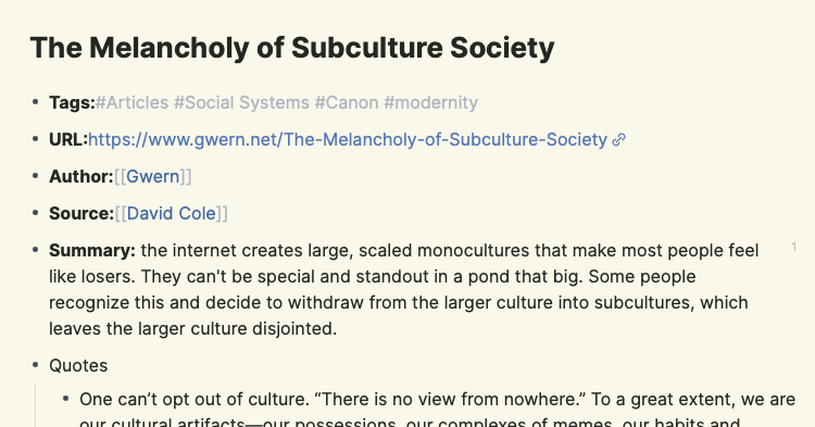
<p>I made these books, podcasts, projects, etc pages in Roam, and used Roam’s metadata mechanic (Page Name::) to give them structure. All pages start with “Tags” for describing the page type and linking to related pages, and then different metadata fields based on the type of page it is. Articles have URLs and authors, projects have statuses and outcomes, etc.</p>

<p><img src="/assets/images/roam-research--3.png" alt="Articles in Roam" /></p>

<p>Some metadata types that have been particularly useful for me:</p>

<ul>
  <li>[[Summary]] is a useful writing prompt for a tweet-length summary of what I’ve read</li>
  <li>[[Further Reading]] is useful as a place to drop related links – this actually ended up replacing Instapaper entirely for me.</li>
  <li>[[Status]] allows me to aggregate pages by their state, e.g. what projects are active versus completed</li>
</ul>

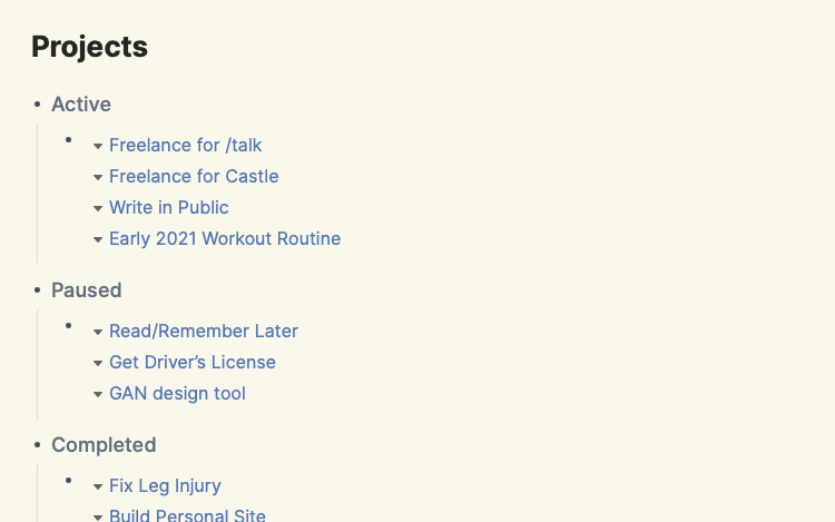
<p>Sometimes, a page type needs a dashboard-style page. I use a  combined with [[Status]] to generate a sectioned dashboard, e.g. for projects I have in-flight:</p>

<p><img src="/assets/images/roam-research--4.png" alt="Project Dashboard" /></p>

<p><em>For more on how to use queries, see <a href="https://roamhacks.com/how-to-query-roam/">this Roamhacks guide</a></em></p>

<h3 id="writing">Writing</h3>

<p>Sometime in 2016-17, I lost the ability to post almost anything publicly. Twitter had become such a PvP zone that I didn’t feel comfortable participating, I didn’t feel like I was ‘good’ enough to post on Instagram, and long-form writing felt out of the question. Roam got me over the hump, and I’m slowly getting more comfortable posting publicly again (I’m sorry).</p>

<p>It started as an outgrowth of taking notes, entirely private. I’d write tweet-length summaries of ideas that kept cropping up in what I was consuming or talking about with friends. Those summaries started getting longer, and over time, I accumulated a decent collection of notes, all inter-connected. Linking those notes together to form a draft and then a post was far easier than starting from a blank page.</p>

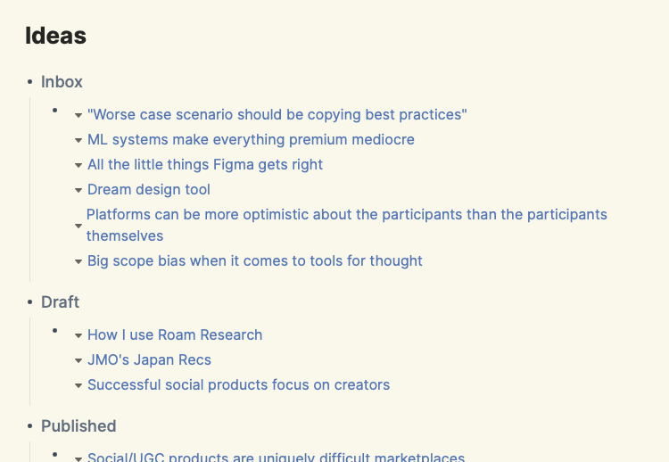
<p>Mechanically, I did this by making pages for each little idea, e.g. [[Atomized sessions makes ML easier]]. That example is a bit incoherent, but it was the kernel of the idea that eventually lead to [[TikTok strategy piece]]. Similar to a project, each idea had a status as I developed it from a kernel into a longer post. Most of the ideas won’t ever get published, which I’m OK with – I’m still squeamish about posting. I use the same  trick from above to turn all of that into a writing inbox:</p>

<p><img src="/assets/images/roam-research--5.png" alt="Writing Dashboard" /></p>

<h3 id="setting-goals">Setting Goals</h3>

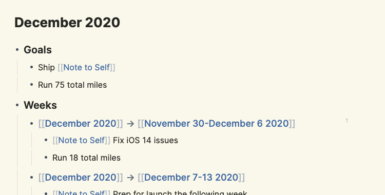
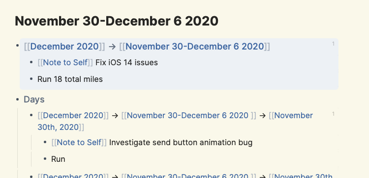
<p>I worked at Quora at a very impressionable age, and like anything you consume at the right age, parts of it are forever engrained in you (for better or worse!). One of the Quora-isms that’s stayed with me is rigorous goal setting, which I maintained even when I wasn’t working for a good chunk of this year, for some reason. Roam lets me set goals to my heart’s content: I have monthly, weekly, and daily goals, and use  to link them all together:</p>

<ul>
  <li>I create pages for each month and for each week. Roam will create the daily pages automatically.</li>
  <li>The goals are nested, so my December goals breakdown into weekly goals, weekly goals into daily goals.</li>
  <li>Mechanically, I write the goals for the child timeframe in the doc for the parent timeframe and embed the block in the child doc. So the [[December 2020]] doc has a “Weeks” section, and a bullet for each week of December, under which I’ll write the goals for that week. I’ll take that block and embed it in the doc for that week. I’ll do the same for daily goals.</li>
</ul>

<p>This is easier to show than tell:</p>

<p><img src="/assets/images/roam-research--6.png" alt="Monthly Goals" />
<img src="/assets/images/roam-research--7.png" alt="Weekly Goals" />
<img src="/assets/images/roam-research--8.png" alt="Daily Goals" /></p>

<p>This format works for me because it lets me keep the right level of context at every time frame, e.g. I often adjust my weekly goals throughout the week, and it’s much easier to do that in a single doc than in several. What’s great about embeds is that they are editable, so I can make adjustments to my daily goals without leaving my daily note.</p>

<p>The month/week docs are templates that also include sections for:</p>

<ul>
  <li><strong>Todos</strong>: random tasks that that don’t fit into a goal</li>
  <li><strong>Reflections</strong>: Sunday nights I update my goals and reflect on the week. I often reference morning journal entries here.</li>
  <li><strong>Reading/Watching/Playing</strong>: I like listing out the media I’m consuming for future reference</li>
  <li><strong>Meal Plan</strong>: I cook a lot and try put together a meal plan for what I’m going to cook that week</li>
</ul>

<h3 id="managing-projects">Managing Projects</h3>

<p>Roam is very mediocre at project management. Although Roam does have multi-user support, it’s pretty rough and I wouldn’t recommend it to use with a team. Roam is good enough for personal project/task tracking. I’ll usually write a high-level roadmap for a project in the project doc, and for bottoms-up tasks just put them in the daily note, under the time block for that project</p>

<h3 id="caveats-abound">Caveats Abound</h3>

<p>As significant as Roam has been for me, I can’t whole-heartedly recommend it. Even putting aside the steep learning curve, Roam still has a lot of issues:</p>

<ul>
  <li>Mobile support is abysmal, a mobile-web version exists but is very cumbersome</li>
  <li>Reliability/performance isn’t great, some users have even lost data</li>
  <li>No API means a lot of extensibility potential isn’t realized (an API is in development)</li>
</ul>

<p>It’s also not free ($15/mo), although a number of <a href="https://nesslabs.com/roam-research-alternatives">free alternatives exist</a>. The upshot is that the Roam community is unbelievably passionate. That helps with some of these issues (e.g. lots of great extensions that get around the lack of an API) but also gives me confidence that longer-term some of the bigger issues will get fixed – there’s no lack of demand here.</p>

<p>Roam can seem like a lot of work. A lot of the benefits don’t kick in till you use it for a while. But if you’ve got a small habit you’d like to change – like journaling in the new year – give Roam a shot. You may just stick with it, and find your screen time more worthwhile as a result.</p>]]></content><author><name>{&quot;twitter&quot;=&gt;&quot;jmohsenin&quot;}</name></author><summary type="html"><![CDATA[Why a culty note-taking app got me writing so much.]]></summary></entry><entry><title type="html">Social products are uniquely difficult marketplaces</title><link href="https://jmohsenin.com/social-marketplaces" rel="alternate" type="text/html" title="Social products are uniquely difficult marketplaces" /><published>2020-10-25T00:00:00+00:00</published><updated>2020-10-25T00:00:00+00:00</updated><id>https://jmohsenin.com/social-marketplaces</id><content type="html" xml:base="https://jmohsenin.com/social-marketplaces"><![CDATA[<p>Social/user-generated content (UGC) products like Instagram, Twitter, or TikTok are a type of marketplace: creators are suppliers of content for consumers. In most marketplaces, suppliers are trying to maximize revenue, but in social/UGC suppliers have many different motivations: some want to maximize audience, while others simply want to share with their family or friends. Different motivations require different incentives, some of which compete or conflict with each other. This makes social/UGC a uniquely hard type of marketplace to build.</p>

<p>Marketplaces work by aggregating suppliers and consumers into the same space. Suppliers have incentive to use the marketplace because the consumers are there and vice versa. Marketplaces typically grow by incentivizing suppliers or consumers to use the marketplace more. Increased usage from one side of the market often leads to increased usage from the other side as well. Incentive design is thus a major activity taken on by organizations that run marketplaces; it’s one of the most effective ways to grow.</p>

<!--break-->
<p>In most marketplaces, suppliers share a core motivation: maximize revenue. There’s usually some diversity within that core motivation – some hosts on Airbnb prefer longer stays because it’s less of a hassle; some Uber drivers are willing to drive at odd hours if there’s a bonus – but by and large, they are trying to earn as much as possible. This makes incentive design relatively straightforward: Airbnb can allow hosts to offer week/month-long discounts, and Uber can give drivers bonuses to drive graveyard shifts. Crucially, these incentives don’t conflict: Airbnb letting hosts offer long-stay discounts doesn’t hurt hosts who don’t have a preference; they’ll just end up with shorter bookings at the margin.</p>

<p>Social/UGC products are different; suppliers have a much wider range of motivations: maximize audience, maximize revenue (not the same!), reach a specific/niche audience, share with friends or family, express themselves, just to name a few. Incentives aimed at these different motivations are often incompatible with each other, e.g. tweaking distribution to help increase creator viewership might harm folks who are trying to engage with a specific audience, or defaulting to public-sharing (as many UGC products do) hampers those who just want to share with their loved ones. Two examples come to mind:</p>
<ul>
  <li>On Quora, some answer writers want their answers distributed as widely as possible, while others are just trying to help the person with the question, they don’t want their answers being distributed or even showing up on their profile. Settings and options may seem like a way out, but <a href="./satisfice">users will satisfice</a> and mostly ignore them – defaults matter.</li>
  <li>On Twitter, <a href="https://twitter.com/noampomsky/status/1204883611264012289">many</a> <a href="https://twitter.com/michael_nielsen/status/1100538006052765696">users</a> have lamented how much worse the tweeting experience gets once you surpass 5-10k followers –  harassment, spam, and misunderstanding all rise. Those users may have been motivated to grow their audience in a certain field, but didn’t want it to grow past a certain point. What could Twitter change to improve the experience for these users <em>without</em> hampering the experience for those that want 100k or 1m followers? There aren’t easy answers.</li>
</ul>

<p>These challenges are part of what makes working on social/UGC products so interesting: there aren’t easy answers to these questions, especially at the enormous scale that most of these products operate it. I think a lot of the answers lie at the intersection of ML-driven personalization and user-defined boundaries around interest and tastes, but that’s a subject for another post.</p>]]></content><author><name>{&quot;twitter&quot;=&gt;&quot;jmohsenin&quot;}</name></author><summary type="html"><![CDATA[Incentives get tricky when supplier motivations differ.]]></summary></entry><entry><title type="html">The surprising impact of reducing batch size</title><link href="https://jmohsenin.com/reduce-batch-size" rel="alternate" type="text/html" title="The surprising impact of reducing batch size" /><published>2020-10-14T00:00:00+00:00</published><updated>2020-10-14T00:00:00+00:00</updated><id>https://jmohsenin.com/reduce-batch-size</id><content type="html" xml:base="https://jmohsenin.com/reduce-batch-size"><![CDATA[<p>“Ship fast” is among the oldest and most common pieces of software wisdom, getting repackaged over the years into Agile, the Lean Startup Method, or <em>move fast and break things</em>. It’s advice so trite that doesn’t even seem worth discussing, but I’ve been continually surprised at just how impactful it can be, specifically when you focus on reducing batch size.</p>

<p>A batch of work is a unit of work that gets shipped to customers. It could be a single copy tweak or a whole new feature; what matters is the end-to-end time from idea to production. Reducing it just means including fewer changes in that batch, <em>not</em> cutting out key parts of the product development process like UI polish, code quality, or QA.</p>

<p>At first blush, large batches might not seem like a problem. If you’re going the process is the same, what’s the difference between shipping feature X and Y together versus just feature X? I felt that way when I started working at Quora and was confused when I saw so much emphasis put into reducing batch size. But I was mistaken: there are a shocking number of benefits to reducing batch size, and I now think it’s one of the most important principles for shipping high-quality software quickly.</p>

<p>What makes small batches so impactful? The best explanation I’ve found comes from <a href="https://www.amazon.com/Principles-Product-Development-Flow-Generation/dp/1935401009">The Principles of Product Development Flow</a>, a dense but great read on effective product development practices:</p>

<!--break-->

<h3 id="why-reduce-batch-size">Why reduce batch size?</h3>
<ul>
  <li><strong>Smaller batches mean end-users get some benefit sooner</strong>: shipping some UI polish in one week means your users will enjoy a more polished product sooner than if you had shipped that polish as part of a redesign that took one month.</li>
  <li><strong>Smaller batches mean you get feedback sooner</strong>: faster feedback leads to better products. Smaller batches lead you to be informed sooner which helps your future batches.</li>
  <li><strong>Smaller batches make reprioritization easier</strong>: it is easier to re-prioritize work in-between batches than in the middle of a batch (sunk cost fallacy, switching costs). Smaller batches mean more instances between batches. Your prioritization decisions also get better because you get feedback sooner.</li>
  <li><strong>Smaller batches reduce variations in flow</strong>: all processes have limits on the amount of flow they can support, and large batches frequently blow past that limit, causing slowdown. A restaurant might be able to handle a dozen customers throughout the day, but a 100-person group will overwhelm the kitchen.</li>
  <li><strong>Smaller batches reduce overhead</strong>: less management is needed for smaller batches. If a new feature has 10 open bugs, a new bug report needs to be checked for duplication 10 times. If a new feature has 100 open bugs, it needs to be checked 100 times.</li>
  <li><strong>Smaller batches are easier to cancel</strong>: often priorities change, conflict with each other, or are sometimes flat-out wrong. Smaller batches are easier to cancel because there is less a sunk cost and a lower chance that priorities have changed since the batch started.</li>
</ul>

<p>That’s not all! There’s second-order benefits of smaller batches that bring even more benefits:</p>
<ul>
  <li><strong>Smaller batches reduce process friction</strong>: smaller batches will hit friction in shipping processes (e.g. “how many people need to get sign off on a copy change?”) much more frequently than larger batches, so fixing that friction will become a higher priority.</li>
  <li><strong>Smaller batches encourage more urgency</strong>: a designer solely responsible for a tweak to the site header due three days from now is going to feel a lot more urgency than if they were part of a team of five responsible for a site navigation refresh due in three months.</li>
  <li><strong>Smaller batches encourage more experimentation</strong>: because the risks of small batches are lower, experimenting with potentially risky changes becomes easier.</li>
  <li><strong>Smaller batches are more fun</strong>: a lot of people derive joy out of shipping work, and smaller batches mean more of those moments.</li>
</ul>

<p>Smaller batches aren’t always easy to get right. The temptation to cut corners like UI polish is strong; it can be difficult to hold a high-quality bar when you’re releasing every single week. Not all batches are independent of each other; X might not be beneficial to users until Y and Z are shipped too. A decent chunk of my Quora tenure was dedicated to navigating these tradeoffs, and I got it wrong pretty frequently – something I’d like to expand on in a subsequent post.</p>

<p>But when you able to ship smaller batches consistently the impact is felt. Having an idea for an improvement in the morning and shipping it to users by the end of the day is a very satisfying way to work, and watching a product grow and take shape through constant iteration provides a lot of fuel for long-term motivation.</p>

<h3 id="references">References</h3>
<ul>
  <li>The core idea comes from <a href="https://www.amazon.com/Principles-Product-Development-Flow-Generation/dp/1935401009">Principles of Product Development Flow</a> by Donald G. Reinertsen</li>
  <li>Reducing work-in-progress is a separate but similarly important method for speeding up product development, <a href="https://lethain.com/limiting-wip/">Will Larson has a good post explaining why</a>.</li>
</ul>]]></content><author><name>{&quot;twitter&quot;=&gt;&quot;jmohsenin&quot;}</name></author><summary type="html"><![CDATA[Shipping smaller chunks of work has more benefits than you probably realize.]]></summary></entry><entry><title type="html">Complexity can’t be removed, only moved around</title><link href="https://jmohsenin.com/complexity" rel="alternate" type="text/html" title="Complexity can’t be removed, only moved around" /><published>2020-10-12T00:00:00+00:00</published><updated>2020-10-12T00:00:00+00:00</updated><id>https://jmohsenin.com/complexity</id><content type="html" xml:base="https://jmohsenin.com/complexity"><![CDATA[<p>A frequent goal in product design is to try and “make it simple”, which often manifests as removing product complexity for the end-user (e.g. removing steps from a flow). This may seem like it’s <em>removing</em> complexity, but in practice it’s usually <em>moving</em> the complexity to a different place – either onto the system, the organization that runs that system, other users, etc. Moving that complexity can still be the right decision, but it’s important to recognize that it’s not being removed altogether: it’s just somewhere else, with different tradeoffs that might be better or worse depending on the context.</p>

<!--break-->
<p>Some real examples I’ve come across:</p>
<ul>
  <li><strong>Moving complexity from the user to the organization</strong>: replacing billing/shipping address fields with an address autocomplete. That typeahead needed to be built, monitored and had various fallbacks designed for when the service went down. This was complexity the engineering team had to permanently manage.</li>
  <li><strong>Moving complexity from the organization to users</strong>: choosing to make some aspects of content moderation run by user moderators rather than done by employees. Moderators now needed to learn to process a moderation queue and dedicate regular time to moderation.</li>
  <li><strong>Moving complexity from the organization to the system</strong>: replacing a rotational user-support system (employees would reply to support emails on a rotating basis) with a help center + triaging logic based on the issue. This system needed to built and maintained.</li>
</ul>

<p>In all these cases, the tradeoff was ‘worth it’ – it was better to have that complexity moved to a different place. But it wasn’t removed.</p>

<p>What about removing a feature entirely? Isn’t that complexity reduction? Not really: users have <a href="https://hbr.org/2016/09/know-your-customers-jobs-to-be-done">Jobs To Be Done</a>, so not having a feature at all usually just pushes that complexity further onto the user:</p>
<ul>
  <li>They may have to spend time hacking together a solution in your product using other features</li>
  <li>They may have to use another product in addition to yours</li>
  <li>They may have to hold that complexity in their head, or otherwise forget it and potentially cause them harm.</li>
</ul>

<p>Importantly, complexity isn’t the same as friction, and friction definitely can be removed: performance improvements, preloading content, auto-focusing text boxes, etc. all remove friction but don’t remove complexity. I don’t quite know when complexity ends and friction begins; it’s a spectrum in my mind.</p>]]></content><author><name>{&quot;twitter&quot;=&gt;&quot;jmohsenin&quot;}</name></author><summary type="html"><![CDATA[It's not that simple to "make it simple".]]></summary></entry><entry><title type="html">Users will satisfice</title><link href="https://jmohsenin.com/satisfice" rel="alternate" type="text/html" title="Users will satisfice" /><published>2020-10-10T00:00:00+00:00</published><updated>2020-10-10T00:00:00+00:00</updated><id>https://jmohsenin.com/satisfice</id><content type="html" xml:base="https://jmohsenin.com/satisfice"><![CDATA[<p>Satisficing is a decision-making strategy where you choose the first option that meets your criteria, rather than reviewing all the options available to you, e.g. ordering from the first restaurant that looks good versus checking out everything that’s open. In software, satisficing is common: tapping on the first link, tab, or action that seems like it’ll accomplish your goal rather than taking the time to learn all the things a product can do.
In fact, satisficing is how most people use software. Most people aren’t going to spend the time to learn everything an app or website can do; they’ll spend the shortest amount of time possible to figure out if the product can help them accomplish their goal, and then move on.
Despite how common satisficing is, designers often have trouble thinking in this mindset. Designers necessarily need to learn the ins-and-outs of the systems they are designing: how each feature works, how it interacts with other features, in what cases it does X instead of Y. But this introduces a curse of knowledge – once you learn a system it’s very difficult to put that knowledge aside and think in a satisficing mindset.</p>

<!--break-->
<p>A few ways a satisficing mindset conflicts with the systems-design mindset many designers operate in:</p>

<ul>
  <li>Satisficing means you scan pages quickly, and it’s beneficial if important pages are linked multiple times on a page. From a systems perspective, multiple links to the same page is duplicative.</li>
  <li>Satisficing leads you to look for familiar UI elements, so commodity UI patterns are helpful because you don’t have to learn what elements are for every product. From a systems perspective, working in commodity UI patterns can be limiting – the solution space of patterns is smaller and might not fit your product.</li>
  <li>Satisficing means you’ll sometimes tap random links or buttons just to see what they do, so it’s beneficial if actions don’t carry much consequence or are easily reversible. From a systems perspective, you want links or buttons to carry real, and for users to only take those actions if they mean it.</li>
</ul>

<p>A good designer can balance these two mindsets. You need to be able to put yourself in the shoes of someone using your product <em>while</em> holding the whole system in your head. Research is useful here: sitting people down and watching them use your product is a great way to see <em>just how little</em> users care about your beautiful system. They just have a job to do, and hopefully, your product can help them do it.
Over time, your intuition for patterns that are satisficing-friendly improves, and it becomes easier to put yourself in that mindset when you’re critiquing work. It starts to affect your systems design choices: you know that some product decisions will lead to a difficult user experience, and can advocate for satisficing-friendly designs when you and your team are making product decisions.</p>]]></content><author><name>{&quot;twitter&quot;=&gt;&quot;jmohsenin&quot;}</name></author><summary type="html"><![CDATA[Balancing a systems-design mindset with a user's mindset.]]></summary></entry><entry><title type="html">Interfaces that help machine learning</title><link href="https://jmohsenin.com/interfaces-for-ml" rel="alternate" type="text/html" title="Interfaces that help machine learning" /><published>2020-10-06T00:00:00+00:00</published><updated>2020-10-06T00:00:00+00:00</updated><id>https://jmohsenin.com/interfaces-for-ml</id><content type="html" xml:base="https://jmohsenin.com/interfaces-for-ml"><![CDATA[<p>Software ate the world, and now machine learning is eating software. More and more products are using ML to provide suggestions, rank content, or filter junk, thus making ML increasingly central to the user experience. When ML is good, it can create a delightful and frictionless user experience, <a href="/tiktok-strategy">like on TikTok</a>. But making that happen requires ML and product design to work together – ML isn’t a magic black box that produces great experiences on its own. Under the hood, ML systems are just making predictions off of past data, and design decisions have a massive impact on the quantity and quality of that data (commonly referred to as signal). Thus, designers can have a massive impact on ML systems through their decisions. To unpack this, let’s look at some design patterns found in popular products and see how those patterns impact the ML in those products.</p>

<!--break-->

<h3 id="turn-user-satisfaction-into-clear-signal">Turn user satisfaction into clear signal</h3>

<p>Nearly all social/UGC products use ML to rank a feed of content that is most likely to engage a user. The most important signals are often related to a user’s explicit behavior – who they’ve followed, what they’ve liked or commented on, etc. If you use social products as much I do, the ML has a lot of signal to use; however, that case is not representative: many users rarely take explicit actions like following or liking, and a surprisingly large amount won’t follow users or like any content, <em>ever</em>. It is very hard to effectively rank a feed for a user when they haven’t provided any explicit signal, and those users are often the least engaged and thus provide the biggest opportunity for increasing engagement.</p>

<p>A common solution to this problem is to turn to less explicit subtle signals: what users have clicked on, read, or watched. Those subtle signals may be more frequently present, but they tend to be noisier: did they really read that story, or just scroll past it? Was that video actually watched, or was it mis-clicked and playing in the background?</p>

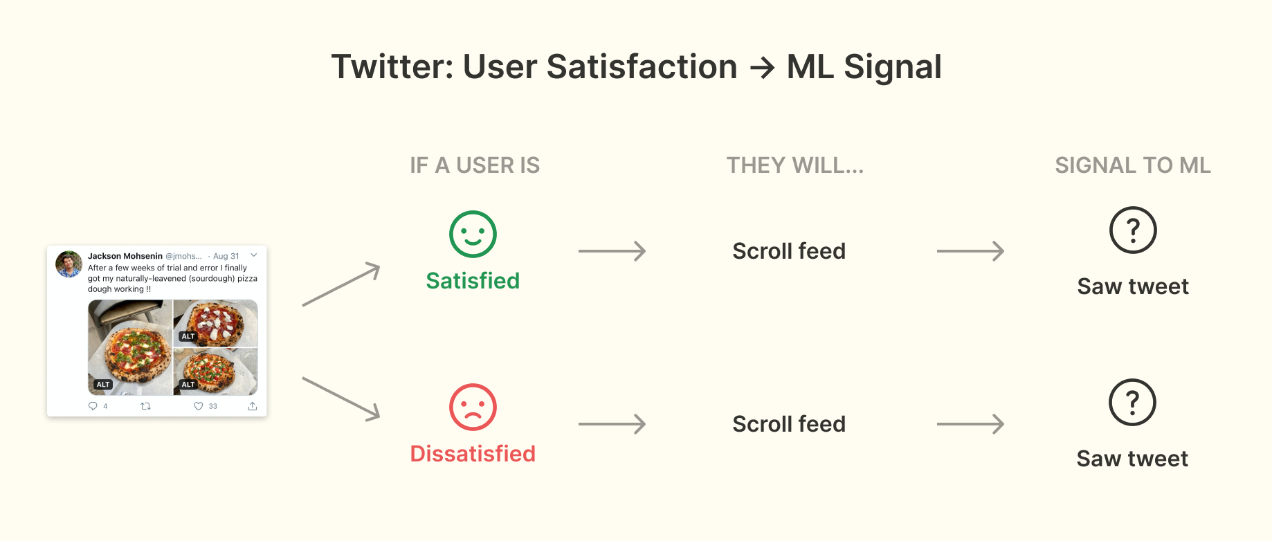
<p>Consider Twitter, where the feed usually has 2-5 tweets visible in the viewport. If a user came to Twitter, scrolled the timeline, and saw a dozen tweets but didn’t interact with any of them, were those good tweets to show that user? Maybe some were good and others weren’t but Twitter doesn’t get any signal about it – they just know that tweet showed up in the viewport. If a user laughed at it, showed it to someone nearby, etc. that is indistinguishable from the tweet right below it that they hated – or didn’t read altogether:</p>

<p><img src="/assets/images/interfaces-for-ml--1.png" alt="Twitter: User Satisfaction -&gt; ML Signal" /></p>

<p>If you imagine that a huge percentage of users fall into this pattern of behavior you can see why this signal loss is such a problem. What can you do about it? TikTok has an answer.</p>

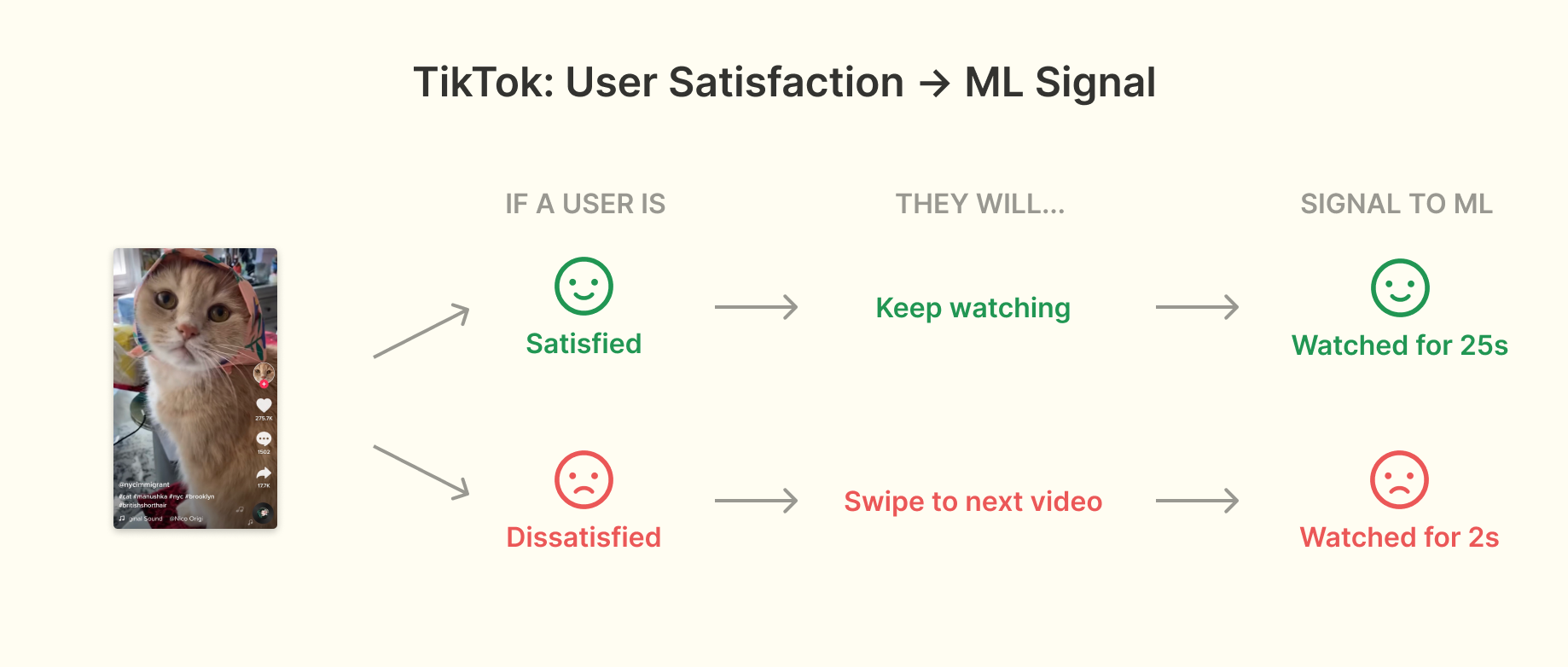
<p>TikTok videos take up the entire screen and play automatically, so a user can only be watching one video at a time. Users also have to explicitly advance to the next video – there is no auto-advance. This turns a subtle signal into an explicit one: every video gets a clear watch time:</p>

<p><img src="/assets/images/interfaces-for-ml--2.png" alt="TikTok: User Satisfaction -&gt; ML Signal" /></p>

<p>If a user really loved a video, there is a good chance they watched it more than once, and if a video was quickly skipped, there is a high chance they didn’t want to watch it. Crucially, regardless of whether or not you’re someone who takes explicit actions, TikTok gets clear signal about which videos you watch. Combined with other ML techniques like clustering, this signal is strong enough that <a href="https://www.axios.com/inside-tiktoks-killer-algorithm-52454fb2-6bab-405d-a407-31954ac1cf16.html">TikTok can provide a good experience after only showing a new user 8 videos</a>.</p>

<p>TikTok’s decision to not auto-advance videos after they are watched (and to not even provide a setting for it) invites a deeper question around what makes for the best user experience when ML is a core part of the product. Many users would prefer to have the option to auto-scroll (there is even a <a href="https://www.change.org/p/tiktok-make-and-auto-scroll-on-tiktok">Change.org petition about it</a>), but doing so would mean a big loss of signal – TikTok wouldn’t get signal on whether I actually watched a video or if I was just waiting for the next one. That clear watch time signal would become subtle. That subtle signal would be harder for the ML to work with, leading to a worse feed and then worse user experience over time. Thus the decision to not allow for auto-advance can be viewed as a user experience hit in the short-term for a user experience gain in the long-term. These types of tradeoffs exist in almost every ML-powered product but are very under-discussed publicly, something that I think needs to change if we’re to make good user experience decisions for ML-powered products.</p>

<h3 id="make-ui-denser-to-give-ml-a-break">Make UI denser to give ML a break</h3>

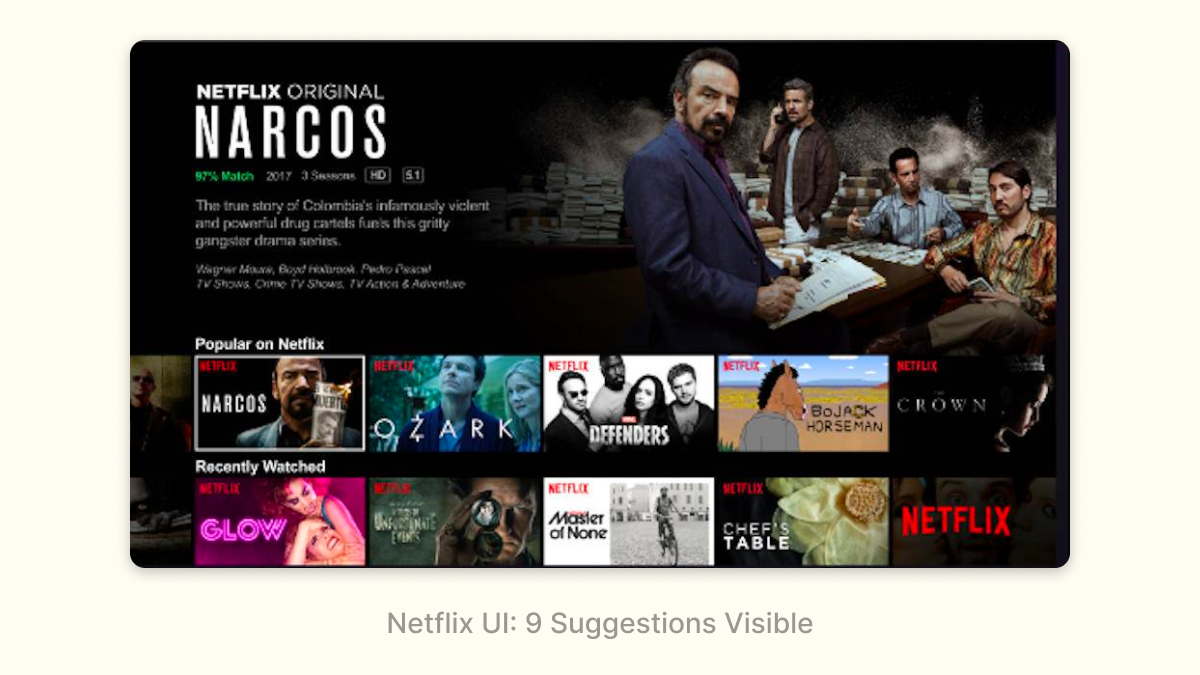
<p>ML is frequently used to help users make choices, e.g. which product to buy product or movie to watch. Deciding which choices to show to the user is a key challenge, especially when the product has limited signal about a user’s preferences. In these cases, a successful strategy is often to make interfaces denser to show more options on a single screen. Doing so helps ‘take pressure’ off of the ranking. Netflix is a perfect example of this:</p>

<p><img src="/assets/images/interfaces-for-ml--3.png" alt="Netflix UI: 9 Suggestions Visible" /></p>

<p>Netflix recommendations are split up into categorized rows, thus allowing users to navigate horizontally and vertically. This benefits both the user experience and the ML:</p>

<ul>
  <li>Users can see around 9 recommendations on the initial screen, and each vertical navigation click/tap gives ~5 new recommendations (one row). This is pretty efficient for the user – with only a few clicks/taps they can see a couple dozen recommendations. The more recommendations that get shown, the less pressure there is for the ML to get any single recommendation right. Imagine you’re trying to recommend a movie to a friend – you’d do a much better job if you could give them five choices than if you could only give them one.</li>
  <li>The categorized rows represent genres or moods, allowing users to navigate at a higher level of fidelity than individual movies. This is a good user experience – sometimes you just know you’re in the mood for an <a href="https://www.theatlantic.com/technology/archive/2014/01/how-netflix-reverse-engineered-hollywood/282679/">Emotional Fight-The-System-Documentary</a> – and it also makes the ML problem easier by splitting a single complex problem (“what does this user want to watch?”) into two simpler ones (“what categories does this user like?” and “what movies in this category would a user want to watch?”)</li>
  <li>Users have the chance to get a great out-of-left-field recommendation: the density of the UI decreases the cost of a bad recommendation, so the ML can take a risk every once in a while.</li>
</ul>

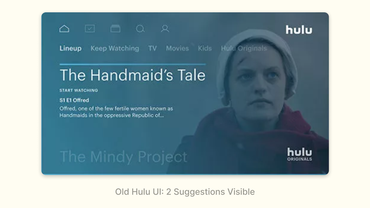
<p>The benefits of this become very obvious if you ever used Hulu’s old interface:</p>

<p><img src="/assets/images/interfaces-for-ml--4.png" alt="Old Hulu UI: 2 Suggestions Visible" /></p>

<p>Hulu used to only show 2 (!) shows on the initial screen, and each vertical navigation click/tap only revealed one additional recommendation. This interface puts a lot of pressure on the ML: if those two initial recommendations aren’t good, users aren’t going to expect the additional recommendations to be good either. Navigating those recommendations are a pain: I have to do it one at a time versus getting an entirely new row on Netflix.</p>

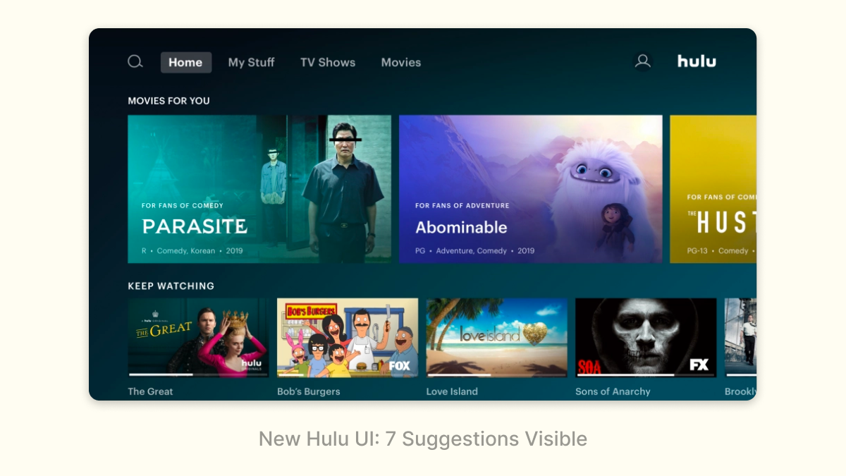
<p>It’s not a surprise that Hulu recently adopted a new interface that is much more similar to Netflix:</p>

<p><img src="/assets/images/interfaces-for-ml--5.png" alt="New Hulu UI: 7 Suggestions Visible" /></p>

<p>Density isn’t always better: at some point, too many choices can overwhelm users, and if there isn’t enough information shown on each recommendation for a user to even discern what the recommendation is, the density is hurting. But in general, density can be an effective pattern, especially in cases where the ML has low-confidence in any individual recommendation.</p>

<h3 id="turn-a-chore-into-a-game">Turn a chore into a game</h3>

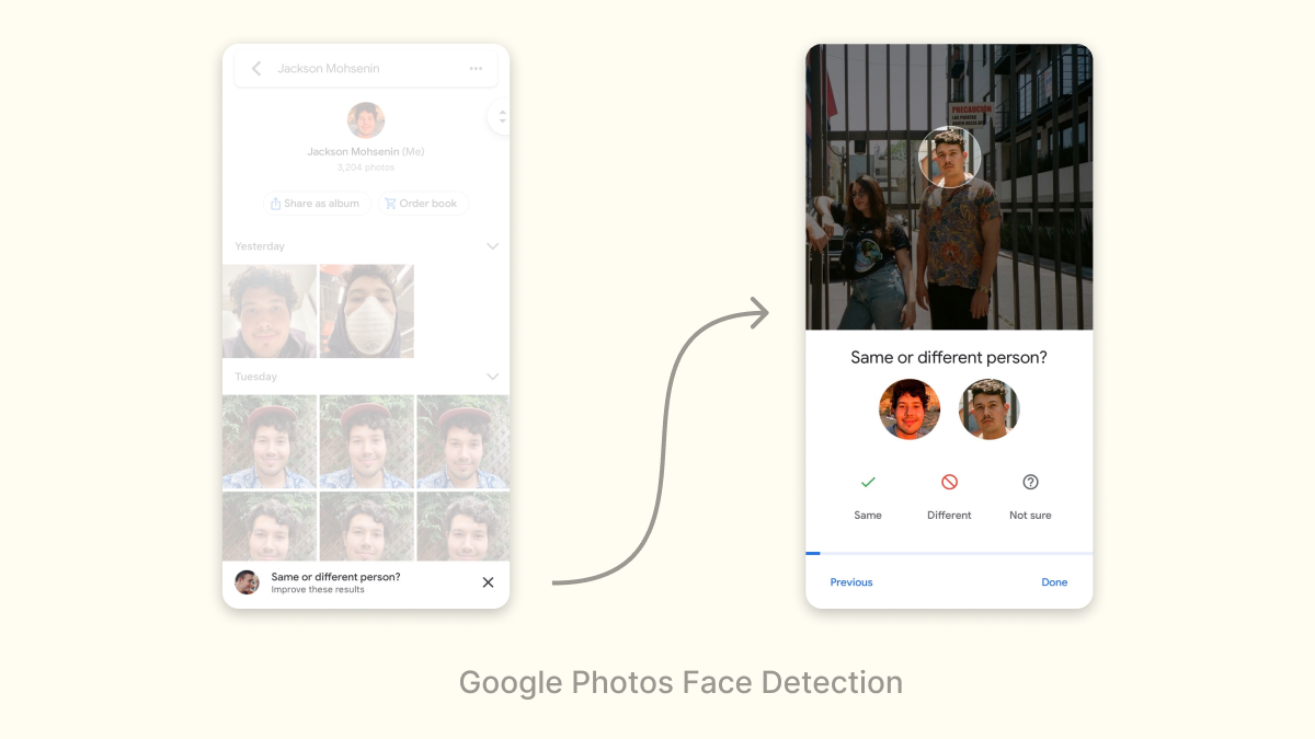
<p>Sometimes, the signal that the ML needs isn’t interesting for a user to provide. A great approach in situations like this is to turn what would otherwise be a chore into a game that makes signal collection breezy and fun. Google Photos does this really effectively with face detection: asking “same or different person/” in a fun game-like interface:</p>

<p><img src="/assets/images/interfaces-for-ml--6.png" alt="Google Photos Face Detection" /></p>

<p>Gamification isn’t a panacea; don’t expect the amount of signal collected to increase by orders of magnitude. But it can be a useful optimization strategy, and get you over barriers where the ML might otherwise be useless.</p>

<h3 id="survey-at-the-right-time">Survey at the right time</h3>

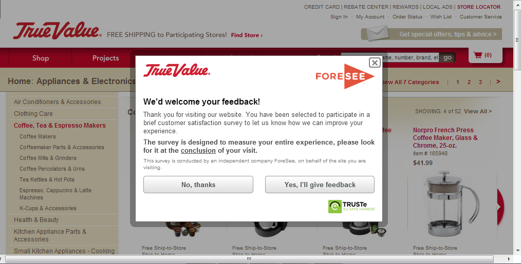
<p>Finally, a dry but effective pattern is to just survey users. However, prompting a survey at the right time and in the right context is essential, otherwise, your product can feel like one of those awful ecommerce websites that <a href="https://wetmachine.com/wp-content/uploads/fuckingPopups2.png">prompt you on the first page</a>.</p>

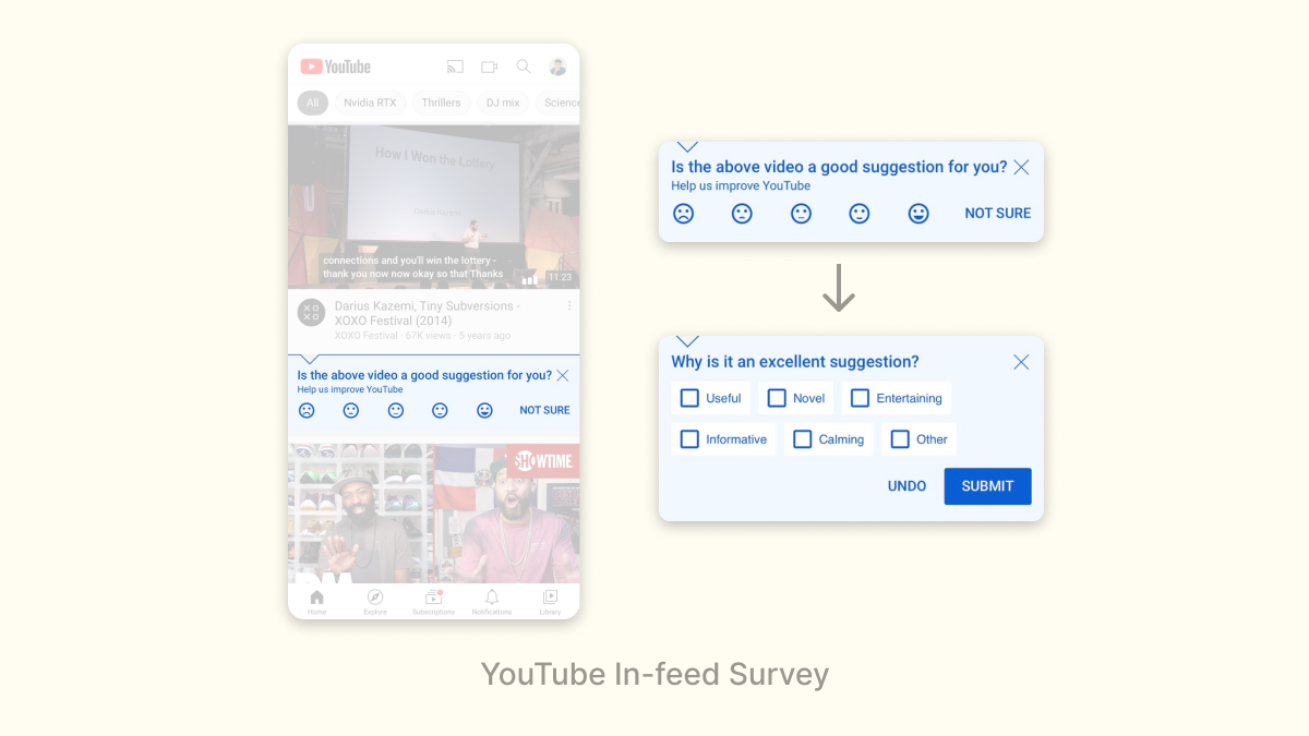
<p>Youtube occasionally surveys users to rate videos in their feed, with a follow-on question to explain why they gave that rating:</p>

<p><img src="/assets/images/interfaces-for-ml--8.png" alt="Youtube Survey" /></p>

<p>This is a great survey because of how unobtrusive it is: a user can simply ignore it if they aren’t in the mood to give feedback, but if you are, they layer on the questions to generate additional signal.</p>

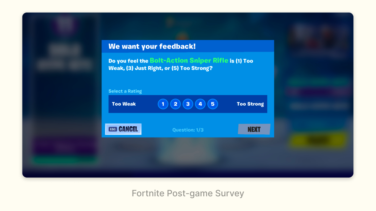
<p>Similarly, Fortnite surveys players after a match to see what they think of recent changes to the game:</p>

<p><img src="/assets/images/interfaces-for-ml--7.png" alt="Fortnite Survey" /></p>

<p>This is a great context to ask players about changes: right after they’ve experienced them.</p>

<p>These sorts of surveys have a very low conversion rate (&lt;1% of users would respond) but it can still be useful as a high-level signal or pulse check.</p>

<h3 id="what-comes-next">What Comes Next?</h3>

<p>These are a few of the most effective interfaces for helping ML today, but they are by no means the ceiling: much better interfaces will be designed. However, I don’t think we’ll stumble on them; navigating the interplay between design and ML will require the development of what is today a gray zone. Public discourse among practitioners about these topics is limited and most organizations don’t set up design and ML to succeed together. Both of these things must change if we’re to create much better user experiences in the future. My hope is that by explaining some basics with this post (and more in the future) we can start creating the common knowledge necessary to turn this gray zone into a full-fledged field.</p>]]></content><author><name>{&quot;twitter&quot;=&gt;&quot;jmohsenin&quot;}</name></author><summary type="html"><![CDATA[Analyzing design patterns that help ML collect signal.]]></summary><media:thumbnail xmlns:media="http://search.yahoo.com/mrss/" url="https://jmohsenin.com/assets/images/interfaces-for-ml-cover.png" /><media:content medium="image" url="https://jmohsenin.com/assets/images/interfaces-for-ml-cover.png" xmlns:media="http://search.yahoo.com/mrss/" /></entry><entry><title type="html">The algorithm isn’t everything: TikTok’s virtuous cycle</title><link href="https://jmohsenin.com/tiktok-strategy" rel="alternate" type="text/html" title="The algorithm isn’t everything: TikTok’s virtuous cycle" /><published>2020-09-20T00:00:00+00:00</published><updated>2020-09-20T00:00:00+00:00</updated><id>https://jmohsenin.com/tiktok-strategy</id><content type="html" xml:base="https://jmohsenin.com/tiktok-strategy"><![CDATA[<p>TikTok’s algorithm must have the best PR in all of tech: a prevalent view is that it’s the singular magic behind TikTok’s success:</p>

<blockquote class="twitter-tweet"><p lang="en" dir="ltr">Total disagreement on my timeline right now as to whether the value of TikTok is 100 percent in its algorithm, or 100 percent in its user base. Where do you land? (I&#39;m more and more convinced that it&#39;s the user base) [POLL]</p>&mdash; Casey Newton (@CaseyNewton) <a href="https://twitter.com/CaseyNewton/status/1305216706546225152?ref_src=twsrc%5Etfw">September 13, 2020</a></blockquote>
<script async="" src="https://platform.twitter.com/widgets.js" charset="utf-8"></script>

<p>With the news that the TikTok/Oracle <a href="https://www.scmp.com/economy/china-economy/article/3101362/tiktoks-algorithm-not-sale-bytedance-tells-us-source">won’t include the algorithm</a> and the possibility that Oracle will have to replace it, some have concluded that TikTok’s popularity will flatline, that it’s only a matter of time before Facebook eats their lunch via Instagram Reels. But despite Facebook’s previous success at cloning the competition, TikTok is a much more formidable challenge: they’ve built strong network effects on top of a unique graph that Facebook doesn’t have – one built on niche interests and esoterica rather than people you know or recognize. Historically, social products have been extremely durable to competition because of network effects, even more so when the graph is unique – Facebook being a prime example. Take the algorithm out of TikTok and it’ll certainly be hampered, but pure algorithmic advantages aren’t that strong of a moat: best practices dissipate through industry quickly, and most of what makes ML good in the first place is the underlying training data generated by user activity.</p>

<p>If network effects are what keeps TikTok on top today, is the algorithm responsible for getting TikTok here in the first place? The answer is a lot more complex than that.</p>

<!--break-->

<h3 id="tiktoks-virtuous-cycle">TikTok’s Virtuous Cycle</h3>

<p>To understand TikTok’s strategy, Michael Porter’s framework is a useful guide. In his seminal <a href="https://hbr.org/1996/11/what-is-strategy">“What Is Strategy?” paper</a> (<a href="https://www.slideshare.net/hitnrun10/what-is-strategy-30278968">non-paywall slide summary</a>), he laid out a framework for what defines a successful strategy:</p>

<ul>
  <li><strong>Strategy relies on unique activities</strong>: the essence of strategy is choosing to <em>do</em> different things and not just rely on general operational effectiveness, which is easily copyable.</li>
  <li><strong>Strategic strength comes from the fit between unique activities:</strong> the unique activities need to be compatible, and ideally compound, such that the total value of all of them is larger than the sum of its parts.</li>
  <li><strong>Activities must require tradeoffs</strong>: some activities are incompatible with each other, while others are a large opportunity cost. If neither is true about the activities a company chooses, a competitor can engage in those same activities with little downside.</li>
</ul>

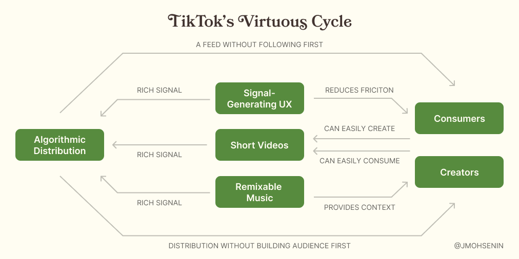
<p>When a strategy is successful, it often forms a virtuous cycle: the activities compound in a powerful feedback loop that causes the product to improve at a faster and faster rate. What is TikTok’s virtuous cycle? Understanding their core activities is a crucial first step:</p>

<ul>
  <li>Videos are short, making them easy to consume and to make</li>
  <li>Consumers mostly watch videos made by creators they don’t know in real life (family/friends) or recognize (influencers/brands)</li>
  <li>Videos are primarily distributed by an algorithm instead of by a follow graph</li>
  <li>TikTok’s UX (auto-playing videos watched one at a time) generates rich signal for every video watched, helping the algorithm learn a person’s preferences quickly (to be expanded on in a future post)</li>
  <li>Music is remixable and the main way trends get started and grow</li>
</ul>

<p>These activities aren’t all unique to TikTok – videos on Instagram are short, YouTube distributes videos algorithmically – but how they fit together and <em>compound</em> is unique to TikTok:</p>

<ul>
  <li>ML algorithms like TikTok’s suffer from <a href="https://en.wikipedia.org/wiki/Cold_start_(recommender_systems)">the cold start problem</a>: it’s difficult to make good predictions about what you will like before you use it. The videos on TikTok are short, so it’s easy for consumers to watch many of them at once, and their UX provides rich signal about every video.</li>
  <li>If the videos are short, you need a lot of it to fill the <a href="https://www.fastcompany.com/90395898/is-tiktok-a-time-bomb">45 minutes per day the average person spends on TikTok</a>. Making consumers follow enough creators to fill up a feed would be extremely cumbersome, so instead TikTok pulls in creators from everywhere in the main “For You” page. This is only possible because the algorithm can quickly learn about consumer’s preferences via the rich signal from short videos.</li>
  <li>How do creators know what kinds of videos to make, and how will the find an audience? Remixable music provides a signal of demand about what consumers want to watch and provides context and an audience for a creator to riff off of, <a href="https://www.tiktok.com/music/Mi-Pan-Su-Sus-6833400908727061253">no matter how weird</a>.</li>
</ul>

<p>The compounding strength of this strategy is made crystal clear when you consider how frictionless it is for both creators and consumers to have a great experience on TikTok, and how it gets better for both groups as TikTok gets bigger:</p>

<ul>
  <li><strong>Creators</strong>: make videos using music as context, audience, and signal without having to develop an audience first or risk alienation of people you know in real life; as more and more consumers use TikTok, the niches only get deeper and weirder, and the algorithm gets better and better at routing your videos to the right consumers.</li>
  <li><strong>Consumers</strong>: get a great feed experience without having to do any work to find and follow accounts; your feed gets better and better as TikTok gets more data about what you like and creators make more videos for every conceivable niche.</li>
</ul>

<p><img src="/assets/images/tiktok-cycle.png" alt="TikTok's Virtuous Cycle" /></p>

<p>This is a strong strategy, but critically, <em>this needs a certain amount of scale to work.</em> When TikTok was much smaller, many of these effects were much weaker. Fewer creators leads to fewer videos to choose from, making TikTok less engaging to consumers. Fewer consumers leads to a smaller potential audience, making it less enticing for creators. How do you solve for this and get to scale quickly, in a landscape as saturated as consumer internet? Paid acquisition. TikTok spent $1b on it throughout 2018 alone, becoming <a href="https://sensortower.com/blog/tiktok-revenue-downloads-2019">the second-most downloaded app in 2019</a>, <a href="https://sensortower.com/blog/tiktok-downloads-2-billion">topping 2 billion downloads by April 2020</a>, and recently announcing they have <a href="https://www.cnbc.com/2020/08/24/tiktok-reveals-us-global-user-growth-numbers-for-first-time.html">100 million MAUs in the US alone, 50% of those DAUs</a>. This is an enormous amount of money to spend on user acquisition and only makes sense if your ARPU exceeds your CAC (unclear for TikTok) and/or you have strong network effects. <a href="https://markets.businessinsider.com/news/stocks/bytedance-60-billion-tiktok-global-us-valuation-2020-9-1029606381">With a rumored valuation in the $60 billion range</a>, it seems that bet paid off.</p>

<h3 id="what-this-means-for-facebook">What This Means for Facebook</h3>

<p>Instagram Reels isn’t going to supplant TikTok by simply cloning a few of its key aspects. TikTok’s activities require tradeoffs that Instagram might not be ready to make. Pushing Instagram creators to make Reels comes at the cost of other content they could make. Pushing Reels in the Home and Explore feeds siphons off consumer attention that would otherwise go to the rest of Instagram. The resulting signals are much messier given the different and competing goals within Instagram, making it harder to train a great algorithm.</p>

<p>Even if Facebook is ready to eat that cost, the experience is still going to be worse than on TikTok: Instagram’s graph doesn’t overlap heavily with TikTok’s, so Instagram’s ability to leverage their graph to jumpstart Reels is limited. TikTok is successful in part because the content is different than Instagram, where you could make and watch weird, funny, unpolished videos you wouldn’t find elsewhere. This is the critical difference that makes the Snapchat/Instagram stories saga non-comparative: Snapchat and Instagram’s graph had very high overlap, such that people could start using Instagram stories with little loss. This is not true of TikTok/Instagram and makes me skeptical that Reels is going to easily displace TikTok. Network effects are just that powerful.</p>]]></content><author><name>{&quot;twitter&quot;=&gt;&quot;jmohsenin&quot;}</name></author><summary type="html"><![CDATA[How TikTok’s product design, growth strategy, and algorithm compound to form strong network effects.]]></summary><media:thumbnail xmlns:media="http://search.yahoo.com/mrss/" url="https://jmohsenin.com/assets/images/tiktok-cycle.png?1" /><media:content medium="image" url="https://jmohsenin.com/assets/images/tiktok-cycle.png?1" xmlns:media="http://search.yahoo.com/mrss/" /></entry><entry><title type="html">Japan travel recs</title><link href="https://jmohsenin.com/japan-recs" rel="alternate" type="text/html" title="Japan travel recs" /><published>2019-11-28T00:00:00+00:00</published><updated>2019-11-28T00:00:00+00:00</updated><id>https://jmohsenin.com/japan-recs</id><content type="html" xml:base="https://jmohsenin.com/japan-recs"><![CDATA[<h3 id="itinerary">Itinerary</h3>

<ul>
  <li>Most folks I know who travel to Japan go for at least a week. I think Japan is most interesting at the extremes, so I recommend spending most of your time in a big city and a few days in the country.</li>
  <li>Start in Tokyo. It’s so big that I would actually recommend staying in two different places within Tokyo if you are there for more than a week, just to experience more of it. Shibuya is a great place to stay your first-time – it’s probably what you picture when you think of Tokyo – but it can also be pretty touristy and commercial. Ebisu/Nakameguro and Rapponigi would be my other first-time recs; Shimo-kitazawa, Asakusa, and Ayoyama/Omotesando are also excellent but a little less accessible by train. I would avoid Shinjuku.</li>
  <li>Naoshima is the most amazing art experience I’ve ever had. It’s a small island in southern Japan that has a bunch of museums and insallations. Tadao Ando designed many of the spaces on the island, Yayoi Kusama’s Yellow Pumpkin is there, and James Turrell and Walter de Maria both created multiple pieces specifically for Naoshima. It can mostly be seen in a day or two, so despite being 6 hours from Tokyo by train it’s worthy of a 2 day trip (you can stay on the island). Teshima is a neighborhoring island that’s a bit more under-the-radar, which might be good as I’ve heard Naoshima prper is bordering on too-crowded post-COVID (I went in 2018).</li>
  <li>On the western coast, I loved Kanazawa, Shirakawa-go, and Takayama. It was a beautiful place to experience fall; Kanazawa is home to one of Japan’s most famous gardens and Shirakawa-go and Takayama are both in the mountains so the colors were just incredible. Shirakawa-go is a traditional village filled with old farmhouses that you can stay in, highly recommended.</li>
  <li>In the south, Onomichi and Miyajima are both excellent. Onomichi is a cute little port town just north of Hiroshima; most notably it’s the starting point for the incredible <a href="https://www.japan-guide.com/e/e3478.html">Shiminami Kaido</a> bike ride, a 70km route across 6 islands with top-notch bike infrastructure. Biking across these semi-tropical islands – stopping for onogiri and ice cream along the way – was an all-time ride. Despite being extremely touristy, Miyajima (famous the floating shrine, Itsukushima) is a total blast, especially if you stay on the island overnight (most folks just do a day-trip from Hiroshima). Sunrise over Itsukushima was somethign else.</li>
  <li>Kyoto is good if you’re really into old stuff (temples, museums, etc). I found it kind of boring and spread out in comparison to Tokyo.</li>
</ul>

<h3 id="tokyo">Tokyo</h3>

<ul>
  <li><a href="https://goo.gl/maps/B7TCB7d796fSre8N7">Here’s my map of my favorite places in Tokyo</a>.</li>
  <li>Tokyo is my favorite place in the world to shop: Nakameguro, Harajuku/Omotesando, and Shimo-kitazawa are all excellent; I budget at least a day in each. Maidens Shop in Harajuku is IMO the best-curated menswear store on the planet.</li>
  <li>Visit a listening bar like Bar Martha, Grandfather’s, or Lion. Owners play records from their existensive collections on hi-fi systems while you drink and smoke – just perfect. The concept exists elsewhere these days but there’s nowhere else like Toyo.</li>
  <li>Drink in Golden Gai. It’s really fun although pretty touristy. I love The Albatross.</li>
  <li>Go to the electronics stores and arcades in Akhibara. It’s wild to see the diversity in electronics; so many products that exist in Japan only. The arcade culture is really out of this world, particularly in the evening.</li>
  <li>Have a Lost in Translation experience at the Park Hyatt. You can go to brunch at Girandole but I recommend going to the New York Bar at night. It is not cheap ($100 for cover + a round of drinks for two) but the view is incredible (plus you can smoke in there).</li>
  <li>Take a day trip somewhere outside the city. Hannah and I had a really nice time staying at a ryoken + onsen (Japanese traditional inn) in Hakone (1.5hrs away). A lot of people have fun going to Kamakura (where the big buddha is).</li>
</ul>

<h3 id="stray-impressions">Stray Impressions</h3>

<ul>
  <li><a href="https://www.youtube.com/watch?v=uwwmKcFVji8">This 20m documentary about KFC entering the Japanese market in the 80s</a> is a great lens on ways Japan is different from the US/Europe.</li>
  <li>One of my favorite things about Japan is that high-quality food is readily available in small-portions (not just at convienence stoies, restaurants too).</li>
  <li>Try and plan each day such that you can enjoy the sunset wherever you are.</li>
  <li>Nobody eats or drinks while walking around or waiting for a train, always at a place dedicated for eating.</li>
  <li>This won’t affect you as a tourist but if you’re curious about Japanese working culture I really enjoyed <a href="https://www.kalzumeus.com/2014/11/07/doing-business-in-japan/">this blog post</a>.</li>
</ul>

<h3 id="logistics">Logistics</h3>

<ul>
  <li>The ‘no trash cans’ thing is real, they are nowhere to be found. After three trips I still find it perplexing. Convenience stores often have trash cans that you can use.</li>
  <li>Don’t tip anyone anywhere, they will find it very rude.</li>
  <li>Most places accept credit cards, but cash is still pretty important (especially smaller restaurants). Convenience stores usually have ATMs. The 7-11 ATMs are particularly great because of the satisfying way it dispenses your cash (it feels like opening a loot box in a game).</li>
  <li>Restaurant star ratings aren’t a very useful signal in Japan: the distribution of them is far more normal than in the US/Europe (e.g. you’ll eat at plenty of 3 star places) but also less predicive of a great experience. I’ve struggled to find a definitive answer; my leading theory is:
    <ul>
      <li>Tabelog is the Yelp equivalent in Japan, and was historically dominate with locals. The star rating norms were quite different: 3.5 is great, 3.75 is stellar, and almost nothing is above a 4 (including Michelin-starred restaurants).</li>
      <li>Google Maps is more popular with tourists, where US/European rating norms flourish (e.g. everything is 4-5 stars).</li>
      <li>As Google Maps has become more popular with locals, Tabelog rating norms have become more prevelant (you can see this in translated reviews, e.g. a raving review from a Japanese person gets 3 stars)</li>
      <li>The resulting ratings are just scrambled between the two groups, e.g. a 4+ star place is often a tourist trap.</li>
    </ul>
  </li>
  <li>If you’re traveling to a bunch of places within Japan, it’s probably a good idea to get a JR rail pass, which allow for unlimited use of Japan Rail train lines for 7/14 days. You should buy them in advance of your trip (e.g. <a href="https://japan-rail-pass.com/">here</a>), it’s cheaper than buying it once you’re there. If you’re mostly staying within Tokyo, it probably doesn’t make $$$ sense. <a href="https://www.japan-guide.com/railpass/">Here’s a useful calculator</a> if you’re on the fence.</li>
  <li>Hauling luggage around Tokyo is a big pain, especially through the metro. Outside of storing luggage at hotels/train stations, there’s a few services (like Klook) that’ll pick-up your luggage from your hotel and take it to the airport for you. Super useful to make the most of your last day.</li>
</ul>]]></content><author><name>{&quot;twitter&quot;=&gt;&quot;jmohsenin&quot;}</name></author><summary type="html"><![CDATA[My recommendations of what to see, do, and eat after a few trips to Japan.]]></summary></entry><entry><title type="html">Snapchat and the myth of unintuitive design</title><link href="https://jmohsenin.com/snapchat-design" rel="alternate" type="text/html" title="Snapchat and the myth of unintuitive design" /><published>2016-12-07T00:00:00+00:00</published><updated>2016-12-07T00:00:00+00:00</updated><id>https://jmohsenin.com/snapchat-design</id><content type="html" xml:base="https://jmohsenin.com/snapchat-design"><![CDATA[<p>This week, an idea that’s circulated in the design community for the last couple of years has come back into play: that non-intuitive, primarily gesture-based interfaces have been key to Snapchat’s success and moreover constitute good design. From <a href="https://news.greylock.com/intuitive-design-vs-shareable-design-88ff6bb184bb">Intuitive Design vs Shareable Design</a> by Josh Elman:</p>

<blockquote>
  <p>I’m here to tell you that the obscurity of Snapchat’s design is not a bug, it’s a feature. Just like Tinder, it’s a design that’s made to engage people and encourage them to share their experiences with others. In fact, it is a key part of what has made Snapchat so successful. Snapchat is one of the greatest examples of what I call “shareable design.”</p>
</blockquote>

<p>Snapchat is no doubt successful, but I’m skeptical that their gesture-based “shareable” interface is the reason behind that success – if anything, I bet it’s hindered them.</p>

<!--break-->

<p>Success has many mothers and Snapchat is no exception: their opaque interface, the early adoption by ‘cool’ LA teens, and the content rules that enabled anxiety-free sharing have all been touted as central to their success. But we should be skeptical of the claim that their unintuitive interface was in fact beneficial – few products succeed because of their interface alone, as opposed to the utility they provide (which their interface may be a part of unlocking).</p>

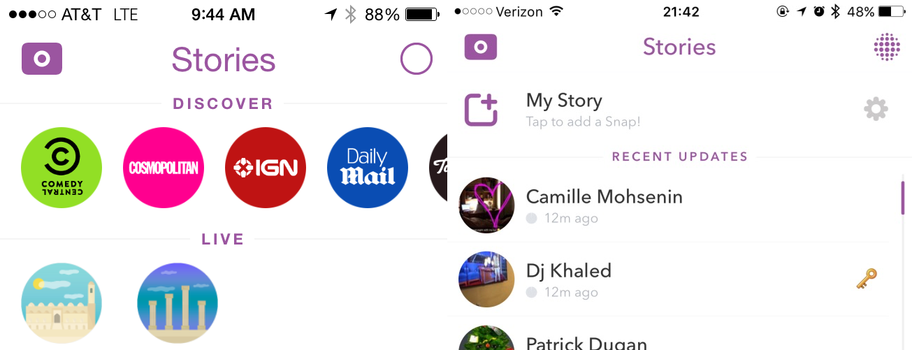
<p>Snapchat themselves seem to be moving away from their own interface, adding additional affordances for many actions:</p>

<p><img src="/assets/images/snapchat-design--1.png" alt="Snapchat story UI" />
<em>Snapchat used to have no add to story link in the stories screen (left). They’ve since added a link to post to your story in that screen (right)</em></p>

<p><img src="/assets/images/snapchat-design--2.png" alt="Snapchat reply UI" />
<em>Snapchat used to have no affordance of how to reply to snaps (left). They’ve since added a reply affordance (right)</em></p>

<p><img src="/assets/images/snapchat-design--3.png" alt="Snapchat new friend UI" />
<em>Snapchat used to just show a yellow ghost when someone added you (left). They’ve since added a call-to-action with an inline accept link (right)</em></p>
<p>Returning to the content rules, the fact that photos and videos shared on Snapchat disappear within a set time window was a key driver for their success. This was the core utility the product provided – early cool users or playful brand may have added leverage, but the ephemeral nature of the network eliminated the posting anxiety that existed on other networks. The anxiety created on other networks was the opening Snapchat was able to exploit.</p>

<p>There’s another claim that because mobile devices are always with us, we learn their interfaces by watching other people use them:</p>

<blockquote>
  <p>The second shift, and this is what many interface designers don’t yet understand, is that people learn how to do things in the real world by watching others. The way most 18 year olds learn how to use a new app is by watching their friends. It’s right there, on their friend’s phone, so they just pull the phone out and show them something.</p>
</blockquote>

<p>This may be true, but I don’t think it represents a shift – this is always how we’ve learned. We learn to throw a ball or pick up a cup from others, but critically, these objects are still as intuitive as possible. Learning always has costs, even if we’re learning from others. I struggle to think of a single example of a real-world tool, socially-learned or not, that is deliberately unintuitive that people enjoy using. I bet this is doubly true in software, where even the most realistic gesture-based software is still metaphorical or representative. <a href="https://www.nngroup.com/articles/computer-skill-levels/">When 14% of users can barely figure out how to delete an email and 26% of users can’t use computers at all</a>, what do we expect most users to be able to accomplish with a gesture-based app, even when they learn from others? An important question becomes: could Snapchat have been more successful if their interface was more intuitive? Their main competitor, Instagram, with an intuitive interface that largely adheres to general app conventions, boasts <a href="https://business.instagram.com/blog/500-million-windows-to-the-world">300 million daily active users</a> compared to <a href="https://www.bloomberg.com/news/articles/2016-02-29/snapchat-s-spiegel-to-investors-we-have-8-billion-video-views-a-day">Snapchat’s 100 million</a>.</p>

<p>I think the path forward is more research into understanding how users – and just not 18-year-old ones – understand non-intuitive gesture-based interfaces. I worry that a successful company has us confusing correlation and causation, as often happens in design, and the result will be a slew of apps that don’t actually serve end user needs. For every Snapchat, there are dozens of interfaces like 3D Touch, which few use and fewer understand. Trends aside, intuitiveness and usability remain critical to software adoption and use. Last, there is no tension between intuitiveness and share-ability. The fact that more learn how to use software from others today doesn’t mean software can’t be easy to use.</p>

<h3 id="references">References</h3>

<ul>
  <li><a href="https://news.greylock.com/intuitive-design-vs-shareable-design-88ff6bb184bb">Intuitive Design vs. Shareable Design</a></li>
  <li><a href="https://www.nngroup.com/articles/computer-skill-levels/">The Distribution of Users’ Computer Skills: Worse Than You Think</a></li>
  <li><a href="https://business.instagram.com/blog/500-million-windows-to-the-world">Instagram Today: 500 Million Windows to the World</a></li>
  <li><a href="https://www.bloomberg.com/news/articles/2016-02-29/snapchat-s-spiegel-to-investors-we-have-8-billion-video-views-a-day">Snapchat’s Spiegel to Investors: We Have 8 Billion Video Views a Day</a></li>
</ul>

<p><em>This post was originally published to the <a href="https://www.quora.com/q/quoradesign/Snapchat-and-the-Myth-of-Unintuitive-Design">Quora Design Blog</a>.</em></p>]]></content><author><name>{&quot;twitter&quot;=&gt;&quot;jmohsenin&quot;}</name></author><summary type="html"><![CDATA[Debunking the myth that Snapchat's hard-to-discover UX was a key part of their success.]]></summary></entry></feed>